Painting on Location with Real Color Wheel | |
http://realcolorwheel.com/cgi-bin/yabb/YaBB.cgi
Color Blind Field Tests >> Colorblind Field Tests >> Colorblind fields http://realcolorwheel.com/cgi-bin/yabb/YaBB.cgi?num=1210471428 Message started by Admin on May 11th, 2008 at 2:03am |
Title: Colorblind fields Post by Admin on May 11th, 2008 at 2:03am
This Topic is about color blindness.
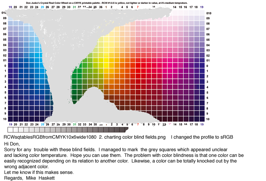
Mike Haskett sent me this in an email. Hi Don, I am a graphic artist living in Sweden. I am color-blind in the real sense, so your web site is a real treat. I do not see tones in the upper red and green scales. If I paint a normal forest scene, it would be dominated by grey and yellow greens. I have to remind myself: "Time for the tube labelled red!" It would be a pleasure to discuss the complications of colorblindness with the group. I often wonder if other color blind artists; i.e. red-green defective, would see my work as appearing perfectly realistic in terms of color? Thanks for including me... Cheers, Mike Haskett I think this is a great opportunity and I am looking forward to it. Mike, I would like to work on color percentages of objects and darkening colors with complements. This seems a reasonable place to start. |
Title: Re: Colorblind fields Post by Admin on May 11th, 2008 at 2:19am
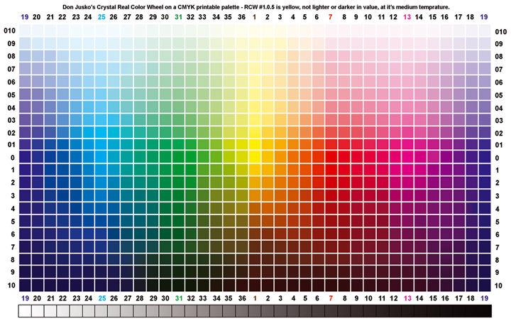
This is the palette you can use for your everyday work on the computer and sending it directly to your printer. It was made in CMYK and converted to RGB. Now all of your colors and mixes will stay in gamut without any conversion that normally changes when you convert from RGB.
If you could download it and put a big black dot in everything that has no color we will see exactly what you can see, when you load it back up. This one is the best, it would be better as a png. |
Title: Re: Colorblind fields Post by Admin on May 11th, 2008 at 2:23am
Here are all best the pigments available shown as clear media (oil) under-tone tints and their full mass-tone colors.
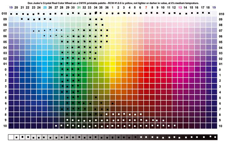
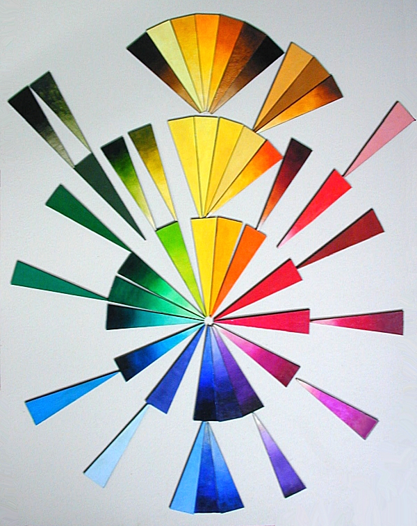
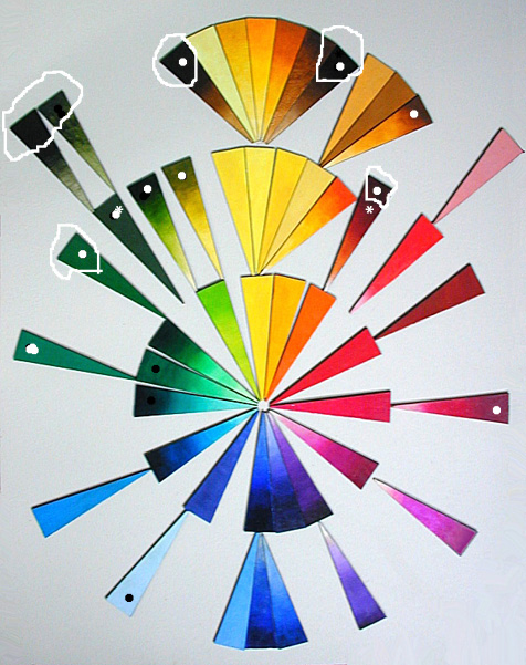
Mike, if you catch this note, mark the ones on this chip chart that you see no color on. Here's the webpage with each color clickable to discribe the pigment. http://www.realcolorwheel.com/colorwheel.htm It's at the bottom of the page. _____________________________________________ Hi Don, Here is a quick check on grey and black (lacking temperature ) zones with actual color pigments i.e. the segment color wheel. I converted it to jpeg to lower the mailing size. I'm a little late when it comes to digital finesse. Hope all is well state side. Mike Attention: the symbol (*) means absolute grey in color. The white and black dots refer to areas appearing of grey or neutral black color. Your color wheel setup and theory together with actual images are really great. Hmmm. I wonder how many color blind artists are out there? Best, Mike Hi Mike, I see it all now. I'm going painting now out on location. I have two paintings of jacaranda trees going at the same time. 4 hours each. So later today I will be able to choose a pigment color palette that you can use and see everything you paint in color. Too bad so much of burnt seanna is out of vision, it is a good mixing color. I'll do more when I get back. Don It was a good day painting. I can see from your chart that you are really turquoise-crimson troubled. Red and green are not opposite colors. Red and cyan are. both of them you have no problem with. The greatest thing is you have no trouble seeing transparent yellow, brown side or orange side. Cyan woiks except for it's dark mass tone right out of the tube. Magenta, the third primary is no problem at all, you can see it from mass to tint. Those three colors (as you know) will make every color including black if all three are mixed in equal porportions. You're full color paintings will be made by percentages of paint. For an example, medium flesh tones would be 1 transparent yellow, 1 transparent magenta, that would make red, a medium flesh tint would be adding 3 whites. The flesh shadows would be 1:1:.5+2Wt. On the color wheel, Read Red Right. So that percentage would read 1:1:.5+2 the last "2" is white, 1:1:1 would be black. Do you prefer acrylics or oil? The same pigments are available in both media. Where you are going to have the biggest problem is mixing your greens, 1:1 is a dark green because they are both transparent. Hansa and cadmium are opaque and make lighter greens. Adding white to this mix makes the color chalkie, adding white to two transparents does not. Generally greens lighten with more yellow, not just white. You don't darken cyan with more mass tone, you dont darken any color with more mass tone, you must add some of the other two colors. If you are using 6 colors to include the secondary colors, just use the opposite color. Primaries have no opposite color, a 1:1 ratio of the other two primaries make it darker. |
Title: Re: Colorblind fields Post by Admin on May 11th, 2008 at 8:59am
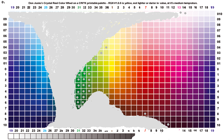
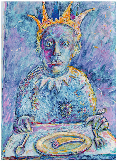
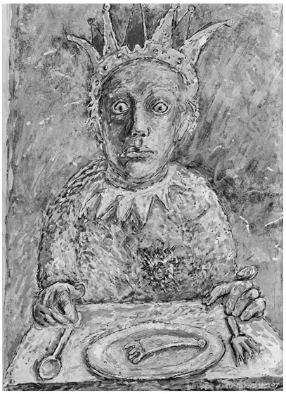
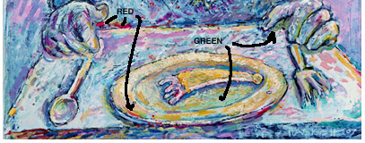
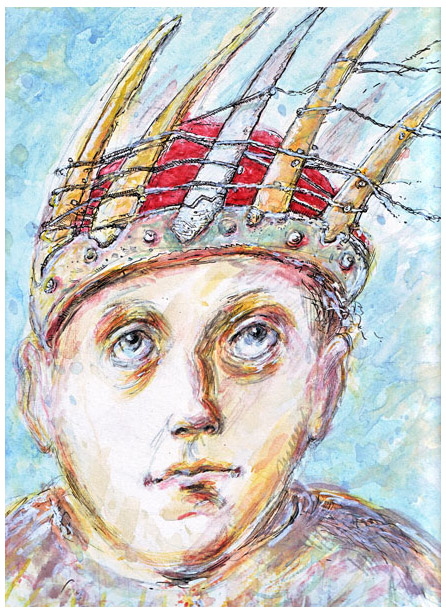
Mike sent me these images.
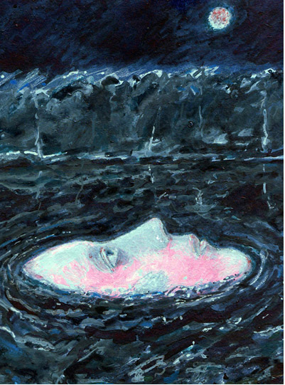
I wish this one had been done with just magenta and green B/s. It really would have been easier with only two colors instead of black in there. I know there is no way you could see the different mixtures so you would have to mix by percentages. Wow, that's magic! Ingris had a style a while ago where he would paint the whole painting in shades of gray and wash over it with color. if you had a transparent yellow along with magenta and Thalo blue you could do the same thing with 3 colors. An equal mix of all three would make black. You can make red and green easyly with the primaries but blue is the hardest mix to make. Add ult blue to your palette, next add purple. After that add a turquoise, plus the transparent yellow nickle complex. |
Title: Re: Colorblind fields Post by Admin on Jan 23rd, 2013 at 10:18am
Welcome SavB,
I hope you will be active here. I need your skills and what you will do with them. DonJ |
Title: Re: Colorblind fields Post by Admin on Jan 25th, 2013 at 12:39pm
Hi SavB,
We talked about oils and acrylics, this is a quote from, http://www.realcolorwheel.com/final.htm TECHNIQUE, Doerner said, Reynolds praised a wax soap emulsion combined with Venice turpentine as the best of painting media. I say, try it, you'll like it. It has the consistently of oil paint with a water base, it dries insoluble and permanent. Reynolds, before a portrait setting would under paint the head area in white, so a thin vale of color applied early could be used as a final stroke. Personally, I give my whole support a layer coating of white acrylic, the paint goes on smoother. In oils, I "oil-down" the support to make the strokes smoother. A "wax soap emulsion" is used and shown how to make it on this page. http://www.realcolorwheel.com/ceracolla.htm |
Title: Re: Colorblind fields Post by SavB on Feb 9th, 2013 at 2:01pm
Thanks Don! Sorry for the delay, ongoing mad deadlines etc! All of this sounds very interesting, forgive me if I take a little time to digest, but I hope I can be useful in some small way. :)
Thanks |
Painting on Location with Real Color Wheel » Powered by YaBB 2.5.2! YaBB Forum Software © 2000-2024. All Rights Reserved. |