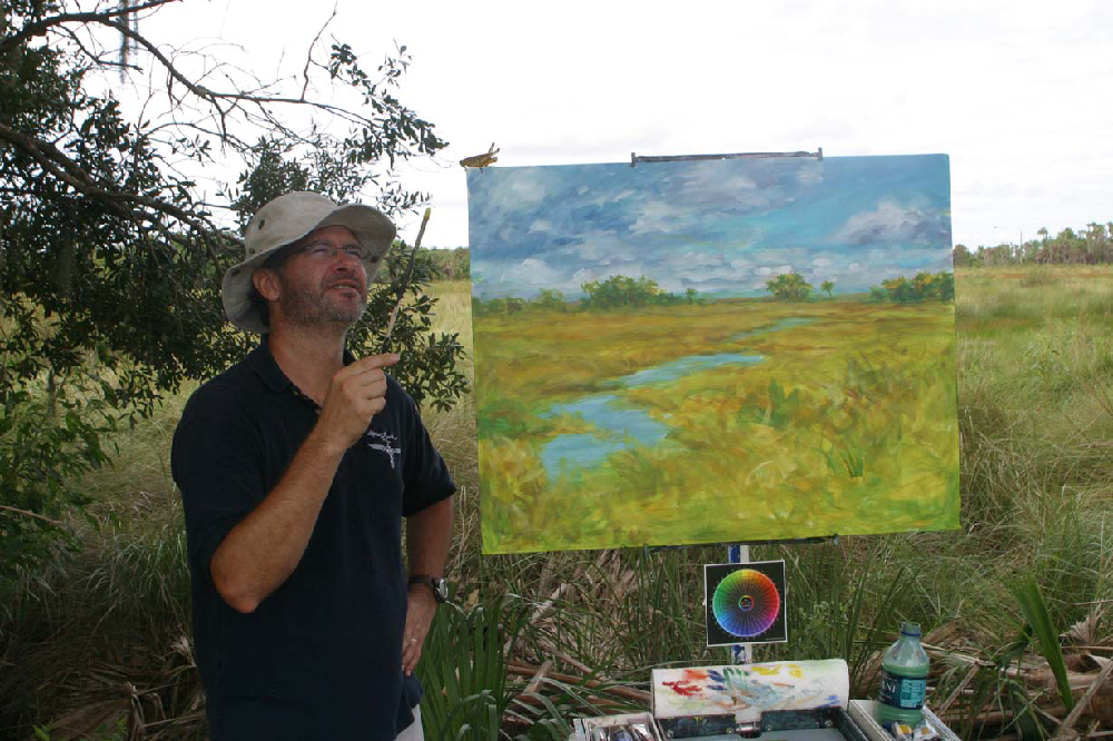
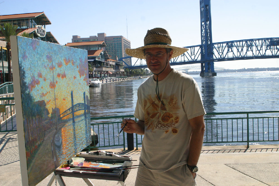
Real Color Wheel with Christophe CardotFlorida Artist Painting on LocationDay 1, 3 colors only, I made too warm browns and dirty blues because I had only PV19. Now he is going to have to use his secondary blue to brighten the sky. Did you notice the little bugger he's pointing at? He stayed around an hour.

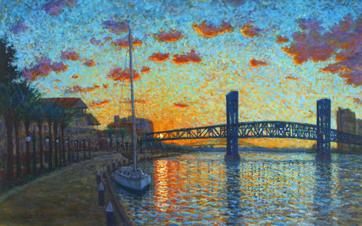
D- Excellent Christophe, this painting should be in a Jacksonville museum. This is probably an East Coast first, only using the correct primaries and secondary colors.
Your perspective is perfect, your colors grand. I like your pointillist approach joining the orange and blue of the sky and the water. About 50 years ago there was a proposition to paint all four bridges different colors, but it failed. Your shadow colors are amazingly correct as are your cloud colors. The reflections of the bridge in the water are also perfectly angled to you.
<BR>I know you are not a boat person and the boat was moving at anchor but the straight water side of the hull should be curved to a point below the water line. The rule, "lightest next to dark and darkest next to light" is in its full glory with the sun behind the bridge.
C- Thanks Don for your comments about this painting. I knew that you would find the mistake with the boat. The boat was not there when I started and left before I finished the painting. Worse, it was really windy when I did add the boat on my picture and it was behind posts that I didn't include in my painting. So I had to move to see the shape of the hull.. So that 's a lot of good excuses for a beginner of boat painting... Anyway, I have to find a book how to paint boats.
D- It's not that you can't paint boats, you can paint anything in front of you and you changed the scene in front of you. You really nailed those reflections.
C- I learned the trick about reflections in water that converge toward you in your web site, thanks a lot for that. It really helped me to do this painting. I had to change 3 times the 2 main vertical parts of the bridge as they was cropped everyday in one way or the other way because my wide canvas was not level. I finally after 3 days found the trick to make an hand made level with a fishing wire and a lead fishing weight. After I made that tool it was so easy to paint the reflections...
I am going to order the transparent brown (to yellow) from Sennelier that should be really helpfull like you said to make the Indian Yellow darker before to made the blue darker. Thanks a lot for this info...
Cc

D- 48x36 is big.
Cobalt blue vs. orange & red vs. cyan an analogous set of oppositions.
Did you notice the sun was earlier by 5 minutes each day?
Did you put a marker where your view point was?
I recognize and like the reflecting light from the sky increasing in size as it gets closer to you on each wavelet, bringing the sky brilliance down as reflection.
You captured the color oppositions very well and that pointillism to convey colored light is awesome.


 Home
Home

 Help
Help

 Search

 Login
Login

 Register

 Broadcast Message to Admin(s)

 « Home
  ‹ Board
  Top of this page
 Pages: 1

