Hi Mary,
Glad you made it to the forum.
I've been away since May, 2004, I'm painting a fresco in the Northwest Territory in Upper New York until Aug 15th.
I just got a local connection here.
The problem is RGB gets darker by subtracting light which is the same as adding black pigment. We don't use black pigment, we add the correct opposit pigment to make darks. For that we need transparent colors.
<I'm making an addition here on 1-6-6>
I like Handprints site, I was just there and marval at our simularities.
This Quote I just read there. It's about the removel of the most important transparent yellows we have as artists. That's my opinion, not their's.
http://www.handprint.com/HP/WCL/pigmt1d.html#benzimidazolone"Metal Complex. A small group of about a dozen azo pigments of marginal industrial significance, and (it seems) with an uncertain future in the world of artists' pigments (production of PG10 and PO65 has been recently discontinued). All combine a symmetrical pair of carbon (organic) compounds with a metal atom (usually nickel or copper). Included in this group are the azomethine metal complexes. Colors range from green (PG8) to green gold (PG10, PY117, PY129), yellow (PY150, PY153, PY177, PY179), orange (PO59, PO65), and red (PR257, PR271). Most shades are rather dull or dark in masstone, but brighten significantly in tints."
<End of insert>
Some of those colors are not the full croma colors of the RGB, they do match the Real Color Wheel's colors though. That's what makes it original.
The original difference is matching the crystal and how it gets dark with the pigment and how it should get dark. Adding white is fair, adding black is not. Yellow and Cyan need an additional pigment each to get darker
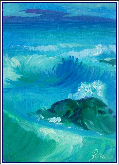
Here is a great practice, paint the waves with only a fan brush. You will feel the action with each stroke. Use a lot of practice paper, this was painted on zerox paper.


 Home
Home

 Help
Help

 Search

 Login
Login

 Register

 Broadcast Message to Admin(s)

 « Home
  ‹ Board
  Top of this page
 Pages: 1

