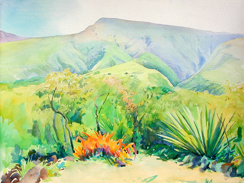
Kaupo Gap, Red Bromeliad, # 902
6-17-03, Water Color, 22x30, 300# Arches Cold PressedDay 1, I made the drawing with 10 mm lead, very sparse, only important lines. Next I wet down the entire paper with my 5 inch elephant ear sponge and waited until it had a dull sheen. This is the most important painting time and you have to be quick because now is when you can do all the major blends. I broke the painting down into three areas. The top, middle and foreground. First I painted in the top area and jumped down to the bottom foreground area. Then I let everything dry. By doing this I can rewet the entire page again and dried colors won't move. Now I painted in the middle ground and quit for the day. 12:00 to 1:30. Tomorrow I will start earlier because there were more shadows and contrast.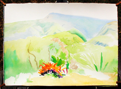
|
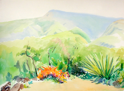
Day 2, Still using my favorite
big brush, the #36 Robert Simmons, series 789, White Sable Goliath. I got a 10:00 start today and worked the middle ground until 12:00. Tomorrow should be a fun day. Today I got some of the darkest darks in. This location is from the house porch in Villa Tamaranda, Piero Resta's place in Kaupo. There were some great weeds in the foreground, Piero thought he would do me a favor and cut them down. That was sad.
|
|
This is my w/c palette. Set up to keep my colors clean.
Opposite colors are in the same well. There are 14 top warm well colors and 14 cool bottom wells. 36 colors. 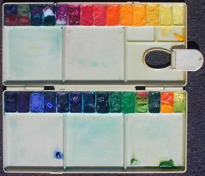
|
Top Colors. Well #1 is a combination of Ult. Blue and Burnt Sienna. Well #2 combines Bocor's Venetian Red because it is on the warm side as opposed to some brands being cool and worthless, and Green Oxide. Well #3 contains two Grumbacher colors, Thalo Green and Thalo Purple. A much used combination for shadows in the middle and background. Well #4 contains Grumbacher Thalo Green and Grumbacher Thalo Crimson, Quinacridone Magenta will do fine. As long as the colors mix to a neutral gray. Well #5 is Grumbacher Thalo Violet. Well #6 is Grumbacher Thalo Crimson. Well #7 is Grumbacher Red. Well #8 is Grumbacher Vermilion Light . Well #9 is Cadmium Orange. Well #10 is Cadmium Yellow Deep. Well #11 is Cadmium Yellow. Well #12 is Bocor Cadmium Yellow, this is a dense opaque yellow, more so then all other brands. Well #13 is Winsor Yellow. Well #14 is Liquitex Lemon Yellow hansa. |
|
I have two smaller palettes also, one with these 36 colors and one set up for night painting.
For a description of my oil palette go here. 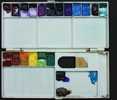
It's worth the time it takes to clean the palette each night. Night palette, 20 of 24 pigments are opaque | Bottom Row, Well #15 is Grumbacher Thalo Blue because I tested different brands and Grumbacher had the cleanest sky color. Well #16 is Thalo Purple. Well #17 is Liquitex Cobalt Blue. There is a lot of differences in cobalt blue among brands. Since it is an easy color to mix with transparents I have this bright Cobalt Blue as an opaque. Well #18 Talons has my choice of Ultramarine Blue. Well # 19 is Winsor Newton French Ultramarine Blue. Well #20 is Thalo Blue used on the yellow mixes. Well #21 is Talons Turquoise Blue. Well #22 Grumbacher Thalo Green b/s Well #23 is Grumbacher Emerald Green, a cool middle. Well #24 is Bocor Emerald Green, very dense and Liquitex Permanent Green Light. Both warm middle greens. Well #25 is three colors, Vermilion, Bocor Olive Green, Holbine Permanent Green #1. Well #26 is Talons Hookers Green Deep and Ultramarine Blue Deep. Well #27 Cadmium Orange Cadmium Yellow Medium. Well #28 Hansa Yellow and Grumbacher Yellow Green. |
Day 3, I'm trying to stay loose while tightning up where I can. Today I switched to a W/N Series 7, #10,
I'll probably finish up with it. We had some rain lastnight and the foreground is turning green :(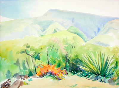
|
Day 4, I have just about 100% coverage, to me that means it's at least 1/2 finished. We had more rain last night.
That means I may have a green foreground instead of gold.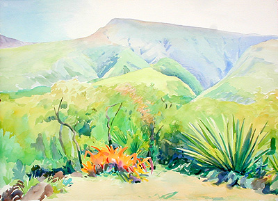
|
