|
It's all about the hue and it's transparency or opaqueness.
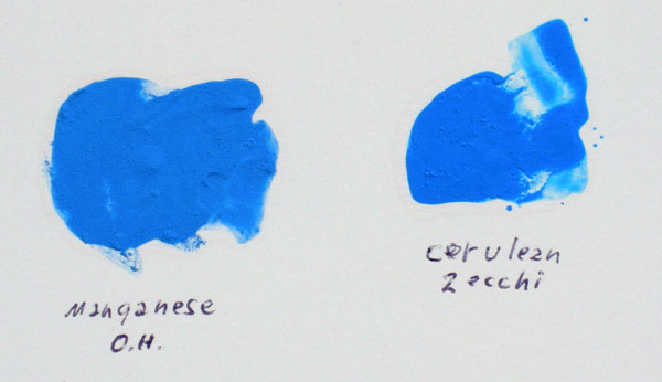
Manganese is the densest cyan opaque, denser then cerulean. Old Holland made a transparent manganese cyan in 2008 that is excellent. Copper can match the rest of the sky. But it's more than that. Copper includes green and manganese doesn't. Opaque Manganese on the other hand is a one trick pony, that one trick being the perfect neutral cyan primary. The manganese blue hue being produced from phthalocyanine is being made more like a transparent cerulean, but even greener. The manganese pure dry pigment is spot on cyan. Opaque cerulean blue dry pigment is sightly on the magenta side in mass and green side as an undertone. This is why I want the transparent manganese blue in watercolor, acrylic and oil paint. O.H. has it only in oil for now 3-15-8. It has no dual-toned qualities, I don't need that in this case. For some reason O.H.'s transparent cyan oil paint leans a little to the blue side. Raul, on another forum said,
TIN OXIDE is black and fires white, mix tin oxide and cobalt oxide with heat and you get cerulean blue. You can get a similar blue by mixing and firing tin and copper chalcanthite with quartz sand like the Egyptians did, this made their highly prized frit colored scarab, which they traded and gave as a calling card through the Phoenician's, ancient world wide. Since an atom was taken out of copper which made it possible to mix with a sulfur based color like flake white the horizon has widened. Now the transparent copper cyan has wider possibilities. The same pigment used to mix black with cad. red can now be used to make a sky color. The sky color is three different colors, depending on how close it is to the zenith or the horizon. I'm happy making the bluer zenith color sky by adding a little purple or magenta PR122. It's the transparent horizon sky color I am searching the best pigment for. The transparent copper based Phthalocyanine with a Chlorinated Copper Phthalocyanine seems to be this color. I would also like it as an opaque pigment. Mixing an opaque white into copper it is one answer, but as Raul said, it's handling properties are not as strong as the full strength pigment. What is that element going to be.. Copper, tin and cobalt or manganese. Maybe it will be a mixture of all three. 2008 - It's transparent Manganate PB13 by Old Holland! |
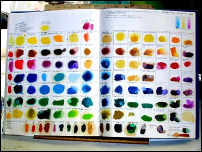
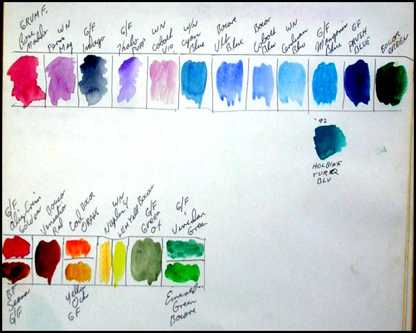
To see this book large enough to read
the colors click below.
Top left half
Top right half
Bottom left half
Bottom right half
If you can't read my handwriting :-P
Here are the oil colors and brands in 8 rows and 10 columns.
Row 1
1-Blockx Byryum Yellow,
2-Mussini Zinc Yellow,
3-Mussini Cad Yell Med,
4-Mussini Cad Yell Lt,
5-Mussini Cad Yell Med,
6-Mussini Naples Yell Lt,
7-Mussini Cad Orange,
8-Shiva Naples Yell (too soft),
9-Blockx Trans Yellow,
10-Old Holland Gamboge Lake
11-Grumbacher Cad Yell Pale,
12-Mussini Perm Yell Lt,
13-Grum Cad Yell Med,
14-Grum Aureolin
Row 2
1-Grum Cad Red Lt,
2-Blockx Venetian Red,
3-Muss Raw Sienna,
4-Muss Raw Umber,
5-Muss Burnt Umber,
6-Muss burnt Sienna,
7-Muss Yell Raw Ocher,
8-Sheva Venetian Red (too cool),
9-Muss Golden Ocher,
10-Old Holland Translucent Yell Oxide,
11-Old Holland Indian Yellow Brown Lake Extra,
12-Old Holland Yellow Orange Lake Extra,
13-W/N Indian Yellow,
14-W/N Indian Red
Row 3
1-Danial Smith Quinacridone Magenta,
2-Rembrandt Chinese Vermilion,
3-Rembrandt Rose,
4-Liquatex Acra Violet,
5-Mussini Violet Perm,
6-Liquatex Dioxazine Purple,
7-Mussini Naples Yellow Deep,
8-Grumbacher Thalo Blue,
9-Mussini Naples Yell Lt,
10-Blockx Naples Yell Lt,
11-Grumbacher Bt Sienna,
12-Mussini Perm Red Dp,
13-Permanent Pigment Cad Red Med Lt,
14-Permanent Pigments Cad Red Lt
Row 4
1-Danial Smith Bright Red,
2-Mussini Ult Deep,
3-Mussini Ult Lt,
4-Mussini Royal Blue Dp,
5-Mussini Manganese Blue,
6-Mussini Royal Blue Lt,
7-Liquatex Thalo Blue,
8-Shiva Blue Lt Thalo,
9-Grumbacher Cobalt Blue,
10-Grumbacher Naples Hue,
11-Rembrandt Asphaltum Ex,
12-Blank,
13-Grumbacher Thalo Red Rose,
14-Grumbacher Cobalt Violet hue
Row 5
1-Danial Smith Organic Vermilion,
2-Mussini Paris Blue,
3-Mussini Cobalt Blue Lt,
4-Danial Smith Mediterranean Blue,
5-Old Holland Schevening Blue Lt,
6-Blockx Cerulean Blue,
7-Mussini Thalo Blue,
8-Shiva Cobalt blue,
9-Not Recorded,
10-Blockx French Ult Lt,
11-Grumbacher French Ult,
12-Rembrandt Ult Violet,
13-Grumbacher Dioxazine Purple,
14-Grumbacher Cobalt Rose
Row 6
1-Grumbacher Thalo Green Y/S,
2-Mussini Phthalo Green,
3-Daniel Smith Thalo Green,
4-Mussini Opaque Green Lt,
5-W/N Perm Green Lt,
6-Mussini Perm Green Lt,
7-Rembrandt Blue Green,
8-Danial Smith Indanthrone Blue,
9-Rembrandt Blue Green,
10-Grumbacher Perm Green Lt,
11-Grumbacher Cobalt Green,
12-Rembrandt Sap Green,
13-Grumbacher Green Earth Translucant,
14-Bocor Cobalt Violet
Row 7
1-Grumbacher Cad Barium Lt,
2-Grumbacher Zinc Yellow,
3-Shiva Green Gold,
4-Rembrandt Chrome Green Oxide,
5-W/N Cad Green,
6-Old Holland Organic Green Opaque,
7-Grumbacher Yellow Green Opaque,
8-Mussini Golden Green Translucent,
9-Not a tube pigment,
10-Old Holland Gamboge Syn + Mussini Thalo Green,
11-Grumbacher Cad Barium Green Lt,
12-W/N Sap Green,
13-Old Holland Green Umber,
14-Not labled
Row 8
1- blank,
2-Grumbacher Thalo Green Y/S,
3-8-All Yarka, too thin in pigment,
9-Old Holland Black,
10-Grumbacher Thalo Green B/S,
11-14-Home made colors
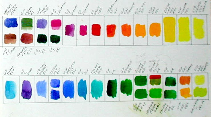
For a Real Color Wheel made with my chosen colors photographed.
Details of the selected oil pigments and palette on a color wheel.
My Oil Pigment palette, the acrylic palette has no transparent yellows. (Yet)
THIS MY OIL COLOR PALETTE, COMPLEMENTARY COLORS ARE OPPOSITE EACH OTHER
White is in the middle of the palette.
The left top of the palette is Liquitex Dioxazine Purple, Mussini Ult. Blue Deep or Light,
Rembrandt Cobalt Blue Deep, Grumbacher Thalo Blue, Mussini Opaque Green Light
and Mussini Thalo Green or Grumbacher Thalo Green Y/S.
The left side goes from the top Liquitex Dioxazine Purple, Mussini Bt. Umber, Mussini Bt. Sienna,
Blockx Venetian Red, Mussini Yellow Raw Ocher, Mussini Naples Yellow Light or Deep to
Daniel Smith Quinacridone Magenta at the bottom.
The bottom row of colors is Daniel Smith Quinacridone Magenta, Rembrandt Rose, W/N Cadmium Red Light,
Rembrandt Chinese Vermilion Extra, Mussini Cadmium Orange, Old Holland Indian Yellow-Brown Lake Extra,
Old Holland Indian Yellow-Orange Lake extra, Old Holland Gamboge Lake Extra, Old Holland Cadmium Yellow Medium.
Grumbacher Cadmium Barium Yellow Pale, Bellini Lead Yellow Lemon is in the bottom right corner of the palette.
The right side is from Mussini Thalo Green on the top, then Mussini Permanent Green Light,
Mussini Genuine Golden Green, Old Holland Yellow Green and Bellini Lead Yellow Lemon at the bottom.
Water Color Pigments
Here is a link to Water Color Lessons on location.
RCW Color Lessons to 10 year old artists.
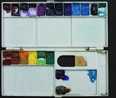
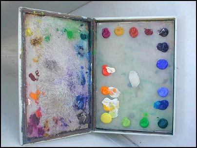
This is what my palette looks like, the colors are combined in wells to facilitate mixing by keeping colors clean.
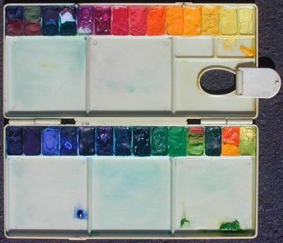

Small everyday palette, 3 1/2 x 8 1/4
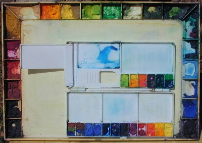
Large studio Pike palette before there was an Indian yellow, 1990, 10 3/4 x 15
Today, 11-3-10, the plastic is yellow.
|
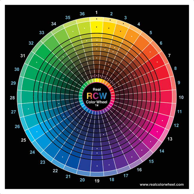
Concentric Ring Numbers for yellow on the 36RCW.
#1.05 tint of the 1st color arc, yellow tint #1.0 Full chroma, the 1st color is yellow #1.0.1 (Warmest of 9) #1.0.9, left to right divisions from warm to cool #1.1 the first dark of 10 divisions to dark of this (first color) yellow #1.2 the second dark #1.3 the third dark #1.4 the forth dark #1.5 the fifth dark of 10 divisions to dark of this first color, also the mass-color of some transparent pigments #1.6 the sixth dark of 10 divisions to dark of this first color, also the mass-color of some transparent pigments #1.7 the seventh dark #1.8 the eighth dark #1.9 the ninth #1.10 the tenth dark, 10% intensity of this 1st color (the darkest). |
#1.00.1 Lemon Yellow Chromate, opaque
#1.00.2 Nickel Titanate Yellow PY53, opaque
#1.00.3 Hansa Yellow Light Arylide PY3, translucent
#1.0.1 Zinc Yellow, opaque
#1.0.3 Bismuth Yellow PY184, opaque
#1.0.5 Aureolin Cobalt PY40, translucent
#1.0.5 Cadmium Yellow Light PY35.1 - Tartrazine PY100 dual-tone, dry for W/c and ink only
#1.0.6 Cadmium Barium Yellow Pale, opaque
#1.0.8 Indian Yellow B/s Nickel Dioxine PY153 Tint, dual-toned
#1.0.9 Indian Yellow O/s Anthrapyrimidine PY108 Tint. - PY153 Nickel complex, Tint, dual-toned
#1.2 Gamboge hue mass-tone translucent PY108 Tint, (more dual-toned than the original)
#1.3 Indian Yell Br/s Nickel Diox transp PY150 Tint, dual-toned
#1.4 Italian Warm Gold Ocher - Verona Gold opaque
#1.4 Nickel Azo, mass-tone translucent PY150 Br/s, dual-toned
#1.6 Raw Umber translucent PBr7, depending on the brand, it could be #1.10
#1.10 Burnt Umber translucent PBr7
#2.00 Naples Yellow Light opaque
#2.0.4 Hansa Yellow Medium translucent PR3, translucent
#2.0.5 Cadmium Yellow Medium, PY35, opaque
#2.3 French Ocher R/s opaque PY43
#2.4 Yellow Oxide/Ocher Br/s opaque PY43
#2.10 Burnt Umber translucent PBr7
#3.00 Naples Yellow Deep opaque
#3.0 Cadmium Yellow Deep opaque
#3.3 Raw Sienna translucent PBr7
#3.4 Italian Deep Yellow Ocher R/s opaque
#3.6 Quinacridone Deep Gold PO48 transparent
#3.7 Transparent Brown Oxide PR101, actually translucent
#3.10 Burnt Umber PBr7, translucent
#4.0.1 Isoindolinone Yellow R, PY110
#4.0.4 Benizimidazolone Orange transparent PO62
#4.0.5 Cadmium Orange PO20 opaque
#4.6 Burnt Sienna translucent
#4.10 Burnt Umber translucent PBr7
#5.7 Italian Burnt Sienna PBr7 translucent
#5.10 Burnt Umber translucent PBr7
#6.0 Vermilion opaque - China Vermilion translucent PR188
#6.10 Burnt Umber translucent PBr7
#7.0.5 Cadmium Red Light PR108 - Thioindigoid PR88
#7.5 Wm. Italian Venetian Red opaque PR101
#7.6 Wm. Red Oxide PR101, opaque
#7.9 Benizimidazolone Brown transparent PBr25
#7.10 Burnt Umber translucent PBr7
#12.0 Quinacridone Rose Bata transparent PV19
#13.0 Quinacridone Magenta Y translucent PR122
#14.0 Cobalt Violet PV49 opaque - Quin Violet PR212, transparent
#15.0 Manganese Violet top-tone PV23 (Rs)
#15.6 Manganese Violet mass-tone, PV23 (Rs)
#16.0 Dioxazine Purple Top-tone transparent PV15
#16.6 Dioxazine Purple Mass-tone transparent PV15
#18.0 Ultramarine Violet Top-tone, translucent
#18.6 Ultramarine Violet Mass-tone translucent
#19.0 French Ultramarine Blue translucent PB29
#19.2 Ultramarine Blue Light translucent PB29
#19.3 Ultramarine Blue Deep translucent PB29
#22.0 Cobalt Blue opaque PB28
#22.0 Azurite, transparent to opaque top-tone, PB28
#22.6 Azurite, transparent to opaque mass-tone PB28
#25.0 Pathalo Blue - Cyan Top-tone PB15.3 transparent
#25.6 Pathalocyanine Blue - Cyan Mass-tone PB15.3 transparent
#27.0 PhthaloTurquiose Top-tone PB15 + PG36 transparent
#27.6 PhthaloTurquiose Mass-tone PB15 + PG36 transparent
#29.3 Opaque Green Light
#31.0.1 Pathalocyanine Green Y/s Top-tone transparent PG7
#31.6.1 Pathalocyanine Green Y/s Mass-tone transparent PG7
#31.0.10 Pathalocyanine Green B/s Top-tone transparent PG36
#31.6.10 Pathalocyanine Green B/s Mass-tone transparent PG36
#33.3 Permanent Green Light opaque PY3 + PG7
#33.6 Hooker's Green Prm. translucent PG36 + PY3 + PO49
#34.6 Chromium Green oxide opaque PG17
#35.0 Lime Green translucent
#36.0 Priderit Yellow Yellow-Green opaque PY157
#36.3 Rich Green Gold Nickel Chelated Azo PG10, transparent
#36.7 Green Gold Azomethine or Irgazine Green PY129, transparent
#36.10 Green Umber mass-tone translucent
I have this separate palette for night painting.
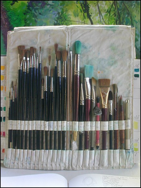
I could never ask for a better selection of water color brushes
This palette box measures 4 x 6 x 3/4, it closes with a flick of the wrist while I'm standing and keeps paint moist for a week of every day use.
To keep the colors really moist and mold free add a little ammonia to the water spray bottle.
The lid includes a towel cloth glued to it with a waterproof glue, that I keep moist. In the bottom is a removable pop-out to clean. The box is 1 inch high
I have a painting I did with my fingers and palm, I kept a bucket of ammonia water (1:20?) by my side to keep my hands clean. I loved it!
Here are 19 most used colors in 1995. Today, 2010, I have added transparent Indian yellow.
Yellow Light Hansa Arylide Translucent, Cadmium Yellow Light Opaque, Cadmium Yellow Lemon Opaque, Cadmium Yellow Medium Opaque, Cadmium Orange
Opaque, Cadmium Red Light Opaque, Acra Violet had a name change to Quinacridone Magenta (PR122 = Primary Magenta) Transparent, Yellow Oxide Opaque, Red Oxide Opaque, Burnt
Sienna Translucent, Burnt Umber Opaque, Dioxazine Purple Transparent, Ultramarine Blue Translucent, Cobalt Blue Opaque, Cyan Phthalo Blue (Primary Cyan) Transparent, Phthalo Green
Y/s B/s Transparent, Permanent Green Light Opaque, Vivid Lime Green Opaque, Brilliant Yellow Green Translucent and three new Liquitex transparent pigments. Acra Gold is orange to brown
acrylic, Acra Burnt Orange is a darker orange to brown and Van Dyke Red Hue a red to brown.
THERE IS NO TRANSPARENT YELLOW PRIMARY COLOR FOR ACRYLICS. 2004
Except the acrylic color I make with dry Zecchi's PY153.
New in 2005 and 2006, D.S., Golden, and many other paint manufactures now make transparent yellow hues.
2010, Transparent Clear Tartrazine yellow by Spectra Colors Corp. is the pigment I use for my
giclee plotter ink and the Transparent Three Primary Water Color Set
for sale.
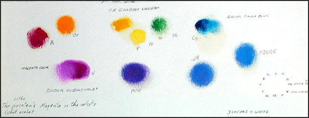
Magenta and cyan are also the pigmented printer inks for my giclee printer and water color pigments.
NEXT, Oil Palette Setup (see the colors), myoilpalettemap.htm
PREVIOUS, Pigment Chip Chart to Real Color Wheel, pigmentrcwmap.htm
PREVIOUS Spectra Color Pigments, spectracolors.htm