
|
|
|
|
|
|
|
|
|
|
|
|
||||
|
|
|
|||||
|
|
|
|||||
|
|
|
|||||
|
|
|
|||||
|
|
|
|
|
|
|
|
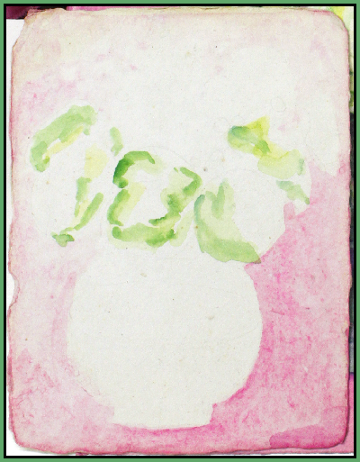
| Today is 3/18/10, St. Patrick's Day just passed and I had these the green carnations...
First draw outlines lightly with a medium hard pencil like H2, B6 is very soft, H6 is very hard. Often I skip this first step and paint the big areas in wet in wet. Wet and wash down the 300# paper on both sides to remove the surface sizing. When the sheen is gone start painting the big areas that need an under color wash. Paint until the paper is dry. Wet it down with your wet sponge again or brush water around the white areas that will either stay white or have a different color, the dried colors won't move. If your are careful about your outlines again in the next wash your can sharply intensify your colors right up to the dry edge. Eventually you will just be pre-wetting the area you are going to paint plus the outline blended area. For me it's always a sharp edge and a blended side. As I continue to do this outlines and colors become stronger. Water colors always dry lighter. I mainly work with a Robert Simmons White Goliath #36 for the big areas (in the picture) and W/N #10 for the details.
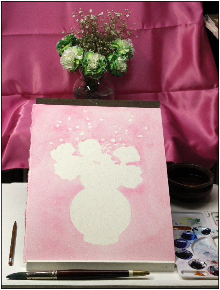 My first wash was with an amazing modern color called ShinHan Opera (PR:122 with BV:10) it's a color with a mass-tone tint of Magenta PR:122 but it's not a tint as it has no white in it. It's super fine grain gives it a transparent quality and for makes brilliant reds and blues and full color shadows. Both Opera colors make very dark neutrals with their opposite color Thalo green. Today it's called yellow/side but it's pure green. I first used this color 5 years ago and this Opera magenta color is still brilliant. That's not fugitive! So now I'm willing to use it when I need it. It will stain water based poly and acrylic paints because the opaque pigment is so fine. On a shiny dark surface the Opera magenta water paint dries opaque but it paints with transparent wash qualities. Before I add any green I'm going to build up the magenta and give the silk some form. All washes leave the white paper areas white. The grays in the vase are a combination of Opera magenta and Thalo green. . 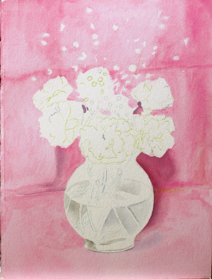 All the pencil lines are erased, the babies breadth are are dyeing but I got them placed already. By the end of the day I had started on the carnations. Today is 3/22/10. It is now 8:30 PM, I added 3 brushes to the mix, all my brushes are sable except for the used-up and rounded 1/4"bristle flat that I use as an erasure. Buying sable brushes is worth it. A pointed 1" liner for the stems of the babies breath, and a flat 1/4" #4 Raphael #905 for the stems in the vase. Have you noticed it's really hard to get a good elephants ear sponge lately? My 15 year old sponge can't be replaced. This Opera color is something grand. It's a mass-tone color I've only dreamed about, well, thought about anyway. It's a very fine grain opaque pigment, fine enough to be used as a transparent pigment. The results are the same as with the Gamboge yellow pigment, it won't change hue like Indian yellow but will change intensities. That makes gamboge a poor choice as a primary yellow and it was replaced by Indian yellow. Opera needs pure magenta PR122 for darker hues, but makes reds and blues more brilliant than the opaque cadmium reds and the translucent ultramarine blue. On the palette that replaces two colors with one color making it worth while. My flowers are dyeing. Now that I'm into doing details, wet the area your going to paint first and blot it. This is a good way to leave your sharp edges and prevent accidental edges from when you leave an area and don't get back to it fast enough. An artists first friend is a clean rag or paper towel, always have it with you. There is a lot of different greens happening in those carnations and I can't wait to get back into the background but these flowers are almost dead. Tip: Change the water often. Painting flowers as they are dyeing is a little like painting a model as they're moving, you better have a good drawing. I'm planning my next painting, it's going to be the dried Queen and Pink Mink protia I did in pastels last month. This new opposition color painting will be opaque cobalt blue PB22 and opaque orange PO20. There is no hurry as the dried flowers will always look the same. There are three ways to have a lighter color without white pigment, 1- use a wash of a darker color, 2- use an opaque lighter version of that hue, 3- use your bristle brush to erase a little of the dried color, touch and blot. Today is 3/27/10. It is now 8:44 AM, The flowers are finished. The pink silk picks up two different colors, from the cool fluorescent and warm fluorescent bulbs. Two days later I bought my answer. 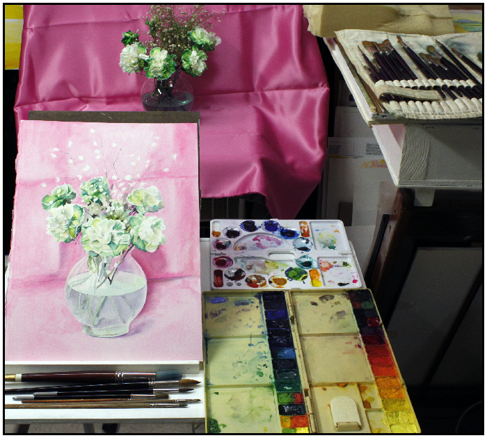
Today is 3/29/10. It is now 3:05 PM
I think I ruined it.. It was coming along fine and thought a quick water dunking to flatten the paper.
I used warm water and left it in too long. I'm afraid I wet down too much and my paper will never have the proper sizing again. It's looking fuzzier, we'll see if my lines hold up.
Thalo green and Opera are an opposition pair made in heaven. They are so perfect together. I'm still working in the highlight to medium colors in the background. But it's going to be something when I get to the darks. The paper is beautiful, just what these two colors need to show what they can do. The Opera paints very transparently and dries opaque. Because because of it's nano size, it stays suspended in water for days. Magenta now has 2 two hues and both, just like there is an Indian yellow PY100 to brown BR7 range of yellow. and there is an Opera pink PR122+BV10 to PR122 magenta range. There is also a cyan to blue range that adds magenta to cyan to make blue in the darks just as the added magenta in the yellow darks makes a warm brown in the yellow range. Today is 3/31/10. It is now 3:28 AM, I bought two new w/c's, an Opera by Holbine which has a darker mass-tone and darker dry wash tone than ShinHan with larger particles that sink in the water bowl four times as fast as ShinHan Opera and another color Holbine Bright Violet with BV7.15. Today is 4/5/10. The combination of these three is like painting with magenta fire, adding the opposite Green 50/50 makes a perfect neutral dark or neutral gray
BV7 is a handy color if needed and since and mixes a good range of color down to 50/50 dark neutral I made a place for it on my w/c palette. My shriveled flowers would be another picture entirely now so I'm done with them, the stems are still there and I still have a little to do with them to make it look simple. The pink silk is almost finished and glowing.
|
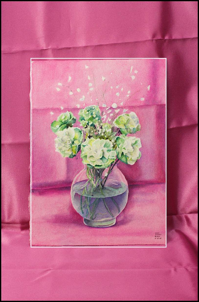
| I started this painting on Indian Hand made paper but it was too hard to control an even wash. So I switched to some Arches color pressed paper and never looked back.
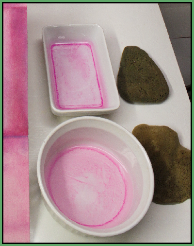
On the bottom right hand corner see the darker bit of color, that's the Holbine paint.
 |
Here you can see the two different Opera pigment colors, the top is darker and courser pigment and settled in 4 hours. The bottom is ShinHan Opera, that took four days to settle. Both colors were important in my painting because neither can be made from any other pigment in the world.
 |
| Those two sponges are both called elephant ear. The top one is how it should be shaped in it's most useful form, I've had it for 15 years. The amoeba shaped sponge on the bottom is what is being sold today as elephant ear. Besides it not having useful straight sides for broad strokes it is a courser sponge. |
NEXT 3 Jacarandas, Water Color, 2010, 3 primary colors, 30x22, Jacaranda2010MakawaoPO3color.htm
PREVIOUS PAINTING
An unbiased test of Gamsol petroleum, gamsol.htm