Use this Real Color Wheel to match pigments that are the correct neutral-dark color mixing complements.
It matches crystal color oppositions.
Use it for mixing shadows and shade colors without using black pigment.
Use it for making 18 different complement sets and 648 split-complement sets.
A color wheel designed by an artist painting only on location from 35 years taking color notes.
Cyan is from the copper element and makes Thalo blue.
The copper crystal has cyan's opposite red color.
Lead makes a blue crystal and a yellow oxide.
Quartz makes a magenta to green crystal.
|
Q. Why is a Real Color Wheel handy?
Q. When you're on location painting or photographing and arranging colors, how do you use it? A. While painting you see an object that needs a shadow. Take the brightest local color on it and mix in its opposite color to darken and shadow it. Here are the correct oppositions to make all shadows or colors that look good together. It takes a lot of memorizing to know each colors opposite so it's handy to read the color in nature and see the opposing pigment on the RCW color wheel. http://www.wikihow.com/Use-the-Real-Color-Wheel |
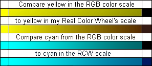
Printer and Plotter artists, color differences between an RGB profile and a CMYK profile.
Color elements make transparent colored crystals which join light and pigment colors. The Red-Green-Blue RGB light spectrum that the computer uses subtracts light to darken colors so only the pure rim colors and tints are similar to the colors of the Real Color Wheel. The RCW matches the way a transparent crystal element becomes darker. This RCW comes in CMYK for pigment color reproduction and RGB for computer work. The CMYK pigment colors are used as inks in my giclee printer and pigments for painting with all media, Here are RGB correct tint colors ( 1 ) & ( 2 ) incorrect shadow colors
  |
|
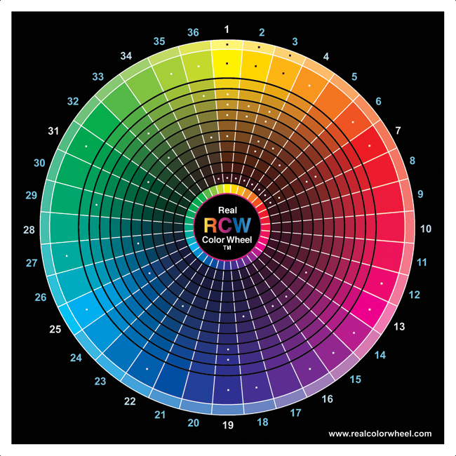
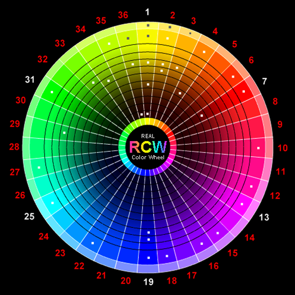
36RCW#36 Yellow-yellow-green and 36RCW#1 Yellow are colors are side by side, each using 10º of the 360º circle.
Transparent magenta and transparent green are opposite, just add any two opposite colors together to get a darker shadow color. Red and green make brown, brown is not a neutral color. |
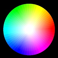
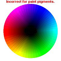
The old Red-Yellow-Blue colorwheel is inaccurate for any artist, compare them.
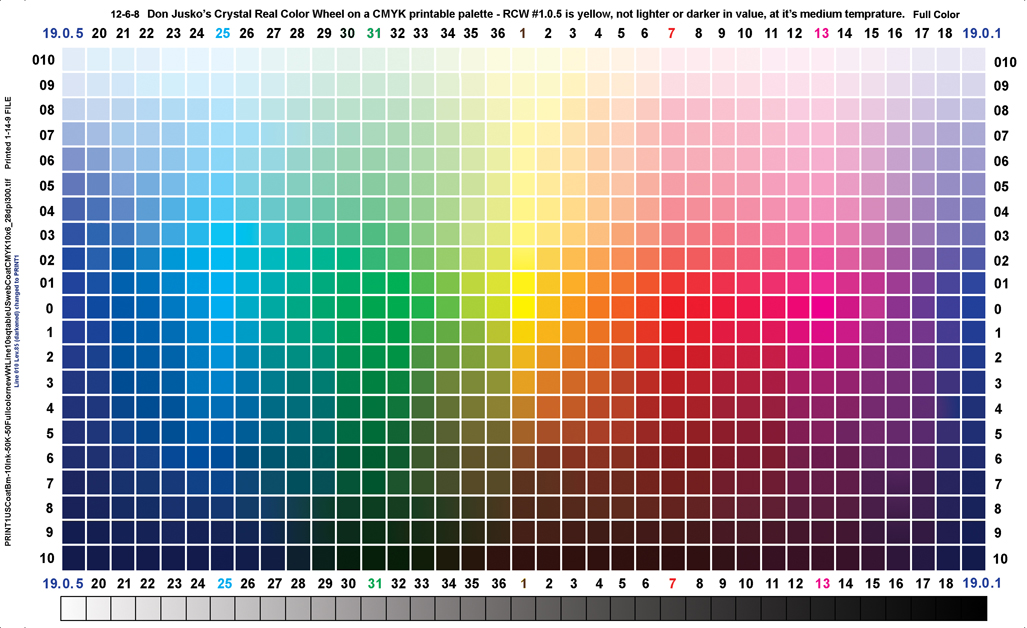
This CLICKABLE chip color map below shows the true opposition
pigment colors for mixing neutral darks on the color wheel.
|
In this table chart of numbers the crystal matching colorwheel darkens yellow to warm brown while cyan darkens to cool ultramarine blue. |
| 00 | 19 | 20 | 21 | 22 | 23 | 24 | 25 | 26 | 27 | 28 | 29 | 30 | 31 | 32 | 33 | 34 | 35 | 36 | 01 | 02 | 03 | 04 | 05 | 06 | 07 | 08 | 09 | 10 | 11 | 12 | 13 | 14 | 15 | 16 | 17 | 18 | 19 |
| 01 | |||||||||||||||||||||||||||||||||||||
| 02 | |||||||||||||||||||||||||||||||||||||
| 03 | |||||||||||||||||||||||||||||||||||||
| 04 | |||||||||||||||||||||||||||||||||||||
| 05 | |||||||||||||||||||||||||||||||||||||
| 06 | |||||||||||||||||||||||||||||||||||||
| 07 | |||||||||||||||||||||||||||||||||||||
| 08 | |||||||||||||||||||||||||||||||||||||
| 09 | |||||||||||||||||||||||||||||||||||||
| 10 |
|
The transparent primary color Yellow in pigments can shade to either a yellow-green Cool Dark, like in the RGB/YMC light system or to a red Warm Dark, like my color wheel has it for pigments. The transparent color pigment yellow must be on the warm side for the artist to mix it with any other warm color. Adding a cool yellow-green pigment to a warm yellow color would lessen the intensity of the yellow and make it dirty. |
Yellow to black in the RGB is very similar to yellow-green's dark in both the RGB and CMYK the colorwheel.
The Real Colour Wheel (RCW), is different. Yellow goes to Red's warm dark brown like in nature,
not green's cool dark which is made by subtracting light as in the RGB colorwheel.
The Titanium crystal has the RCW colors blue and brown in each crystal. It also turns white in the middle.
Rutile crystal link
|
|
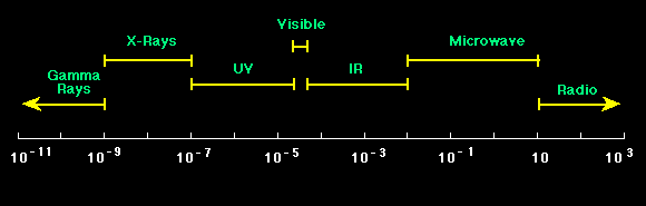
(Shortest Wavelengths) Gama Rays - X-Rays - UV - VISIBLE COLORS - Violet to Red) IR - Microwave - Radio (Longest Wavelengths) Violet, short wave length, high frequency, high energy. Red, long wavelength, low frequency, low energy, radio waves. 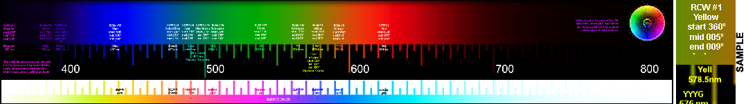
Red could be on the left because it has the lowest frequency 400,000,000 MHz Red could be on the right because it has the longest wave length at 700 nm. Blue could be on the left because it has the shortest wave length per second) Blue could be on the right because it has the highest frequency at 700,000,000 MHz I just got this in my Emails today, 5-23-13 from David, a member of the Tesla group reproducing what Tesla did. James said, "Somehow there's action at a distance and everybody accepts it?",I believe clearly NO. Its not possible to interact at a distance. Physics is about contact anything else is metaphysics.
This is what I already have. (Don).
|
|
The RCW Real Color Wheel is also the Crystal Real Color Wheel. It shows the colors of these elements in there natural progression as they get darker. For instance, crystal oxides containing iron and go from yellow to brown, orange to brown or red to brown. Light's RGB colorwheel is inaccurate for plotting pigments or for the artist to use as a color wheel in the field. Ultramarine blue must be opposite yellow and plot opposite yellow, like on this wheel. It is just as accurate as the simple RGB positioning of pure colors, only better because it includes the correct darker path colors. A new opaque Irgazine Yellow is a perfect warm darker yellow, 36RCW#1.6 while the new Bismuth Yellow is the bright full chroma RCW#1.0 The Irgazine Yellow has a very slight dual-tonality and will mix with its complement ultramarine blue to a dark. Look at Real Color Wheel's #36.0, Yellow-green, and compare it to the primary path to dark for Yellow on the RGB wheel. They look almost the same even though they are two different colors. There is no warm yellow path to dark in the RGB, only the cool Yellow-green path. On the RCW, I properly put them side-by-side. I use the warm path of yellow as the path of pure primary Yellow and the cool path as Yellow-green's path because this is exactly how the pigment crystals darken. Dual-toned Irgazine Green is a transparent Yellow-green and it mixes a neutral-dark with Dioxzine Purple. Here are some crystals that could interest the artist since crystals are pigments and chemicals are made with the same color elements. The Calcite crystal, [CaCo3], makes the perfect Cyan color with the Copper element in the Iceland Spar Crystal which changes color when viewed from different directions (PLEOCHROISM) to the color Ultramarine Blue. The Iceland Spar's copper content causes the color to appear in a span of colors from cyan to ultramarine blue depending on your viewing position to it.
|
|
Note that Transparent Indian Yellow and translucent Gamboge are synthetic hue/color names, these colors as "genuine" pigments are not available or used today. PERMANENT TRANSPARENT YELLOWS
7-10-9, Dual-toned Indian Yellow color chip images, new window. Yellow-Brown-Oxide hue to Lemon Yellow hue, PY:150 (Nickel Azo Brown - Lemon O.H.)
Dual-toned Indian Yellow-Greens;
Yellow-Brown-Oxide hue to Lemon Yellow, PY150 Nickel Azo Complex (Nickel Azo Brown - Lemon by O.H.) Yellow-Orange to Lemon Yellow, PY:153 Org/s, Dioxine Nickel Complex by O.H. PR122 quinacridone = Magenta PV23.1r carbazole dioxazine = Purple PV23 dioxazine nickel complex = Permanent Violet Blueish transparent secondary blue PB60 anthraquinone and indanthrone = Blue Deep to Turquoise PB15.3 copper phthalocyanine (BEST) and PB33 manganese Barium Manganate= Cyan (Thalo Blue and Manganese Blue transparent) PB7 Chlorinated copper phthalocyanine = Turquoise to Green PY83 stable di-arylide + PG7 chlorinated copper phthalocyanine = Sap Green Yellow/Side PY83 stable di-arylide HR + PG7 chlorinated copper phthalocyanine + PO43 perinone orange = Sap Green Orange/Side 2002, Liquitex has some nice new dual-toned transparent colors, Acra Gold = yellow to brown, darker than Indian Yellow Brown Side. A Burnt Orange that's brown to orange and Van Dyke Brown, a brown to red color. 2006, Golden Artist Colors added Indian Yellow Golden Hue, Arylide Yellow PY7, Nickel Complex Azo PY150 and Quinacridone PR206, transparent, very nice Indian yellow. Also added, a green/brown Indian yellow hue called Nickel Azo Yellow, PY150, this color replaces the old PG10.
Used in addition to the transparent primary and secondary pigments for their opaqueness and brilliance. PY35 cadmium Zinc sulfide = Cadmium Yellow Lemon
HOW TO USE THE REAL COLOR WHEEL TO MAKE NEUTRAL-DARKSTo reach a dark neutral use the darkest form of yellow, orange or red (all of which are burnt umber) and mix it with its opposite color.
To darken a yellow object first use the mass-tone of transparent yellow PY150, from that point add the graduated color oxides like yellow ocher light, medium or dark to brown oxide. Green oxides and umbers are sometimes needed.
Cyan first darkens to blue, like the sky, cyan at the horizon and ult/royal blue at the azimuth.
The rest of this color wheel's colors will darken by adding the opposite color until it reaches neutral dark.
Therefore, anyone working with pigments can reliably find truly opposite colors, which will always mix to a neutral dark without using black pigment.
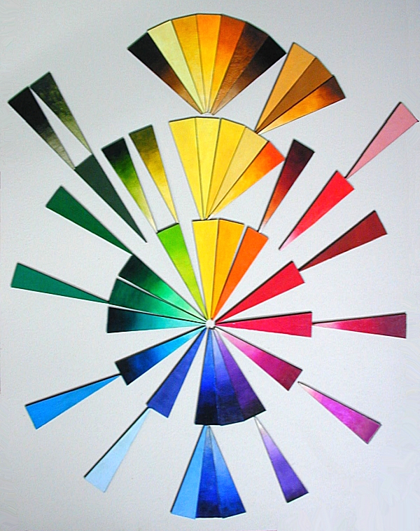
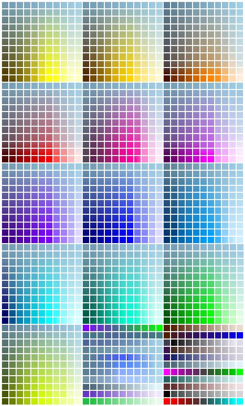
OIL PIGMENT PALETTEThere is a space for each of these colors on my 37 COLOR OIL PALETTE although I may not fill them all every time I paint. White is in the middle of the palette. The top of my palette starting on the left is Dioxazine Purple, Ultramarine Blue, Cobalt Blue, Thalo Blue, Turquoise, Opaque Green and Thalo Green Y/s is on the right side. The left side goes from Dioxazine Purple at the top to Burnt Umber, Bt. Sienna, Red Oxide, Yellow Ochre, Naples Yellow to Quinacridone Magenta at the bottom. The bottom row of colors is Quinacridone Magenta, Rembrandt Rose, Cad Red, Cadmium Orange, Indian Yellow Golden, Cadmium Yellow Medium, encapsulated Cadmium Yellow Light, encapsulated Cadmium Yellow Pale, and encapsulated Lead Yellow Lemon are in the bottom right of the palette. The right side is from Thalo Green Y/s on the top, than Permanent Green Light, Green Gold, Yellow-Green Opaque with Yellow Light at the bottom. I keep all 37 of these oil pigments below on hand with me, they all have their special color and pigment properties. |
36RCW OIL COLORS ON THE REAL COLOR WHEELrcwnickeltitan.htm RCW#1.06.5, Nickel Titanate Yellow, PY53, Opaque
|
|
I think a spectroscope of dried pigment color would show all colors to be impure but this can't always be shown on the web.
I also matched the dried chip color to the computer by eye. It's close enough to paint with a computer tablet, for commercial artwork, interior design, etc. and compare the relationships of similar colors in pigments.
Each color's first number relates to its position on the 36 color Real Color Wheel.
Red, Blue, BlueViolet, SaddleBrown, Brown, FireBrick, YellowGreen, Green, DarkGreen, Yellow, Gold, Magenta, LightSkyBlue. Top-tone is adding White to the color. Under-tone is adding clear, like water or oil. Mass-tone is thick out of the tube pigment.
for web designers and print artists, with in gamut CMYK HEXADECIMAL CODES. | |
All dots are clickable links to each pigment's description page.
The center links to the photo pigment color chip chart pigment page. Pigment artists, don't miss it!
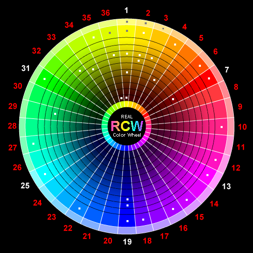
Real Color Wheels are 360, 36, 12, 6 or 3 colors.
| The color "triangles", "arcs" or "wedges" of color are numbered from 1 to 36, the 360RCW shows 360 colors.) |
|
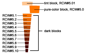
#1.09. is the lightest tint color. Outer tint rings are two digits, they are lighter pigments or tinted hues of this full color. #1.0 All wedges main colors are digit zero, that's 100% full chroma for opaque pigments and a 50% top-tone tint for transparent pigments. #1.01 The darkest tint of the 1st color yellow arc/wedge, two digits. #1.0 the full chroma opaque yellow or a 50% tint of a transparent Indian yellow, both are in block 0. #1.0.1 the coolest of 9 colors within that 10º arc/wedge of the 36RCW. #1.1 the first dark block of 10 divisions to dark of this first color yellow. #1.2 the second dark block. #1.3 the third dark. #1.4 the forth dark, Gold Ocher opaque or the mass-tone of Indian Yellow PY150. #1.5 the fifth dark of 10 divisions to dark of this first color, also the mass-color of some transparent pigments #1.6 the sixth dark of 10 divisions to dark of this first color, also the mass-color of some transparent pigments #1.7 the seventh dark of 10 divisions to dark of this first color. #1.8 the eighth dark of 10 divisions to dark of this first color. #1.9 the ninth dark of 10 divisions to dark of this first color. #1.10 the tenth dark block, 10% intensity of the 1st pure-color. #1.10.1 the tenth dark block at its warmest value, 10% intensity of the 1st pure-color, #1.10.9 is its coolest value. |
C l i c k a b l e A r t i s t s R e a l C o l o r W h e e l : f i n d m a t c h i n g p i g m e n t s
|
The main ring represents the full-chroma (100%) opaque pigment, or a 50% top-tone tint of the darker transparent pigment. All of these colors have warm or cool values, they are indicated by appending from ".1" to ".9" at the end of its wedge number. Pure yellow is written as 36RCW#1.0.5. Cooler would be #1.0.1, warmer would be #1.0.9. The 36RCW is made up of thirty-six 10º "wedges or arcs," (with stacks of "blocks" making the wedge) which are arranged top to bottom and side-by-side, around the RCW logo. A wedge depicts specific intensities of a single color. Darker versions are the blocks below and tinted versions are above the pure-color block zero. 10º WEDGE-ARC-PIE-TRIANGLE NOTATION
BLOCK NOTATION
RELATIVE TEMPERATURE-VALUE NOTATION
REVIEW:
CYAN, RCW#25.6 darkens in intensity to RCW#25.8, dark blue. It's exactly the same as Ultramarine Blue's darkest blue RCW#19.8.
The 7 color wedges from yellow to red and cyan to blue have this similar characteristic while the other colors are darkened with only their opposite color. This is because magenta, like the sky in the evening, takes more than it's share of the color wheel. Magenta light bends around the earth and the color wheel. This color wheel, color elements, crystals of color, and natures all have the same progression of colors.
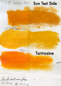
Yellow makes neutral-darks by using dark brown and its opposite color ultramarine blue. Here is a photo of the dark brown liquid (made from yellow's dry pigment) Tartrazine. Tartrazine is not a pigment for sale in tubes yet, but it should be. I use Tartrazine as a water-based ink in my plotter. I use a 1:29 mix in my yellow transparent ink. Here is the permanent transparent ink color in my plotter, it's called Tartrazine Acid Yellow 23, an Azo pigment, PY:100, 36RCW#1.
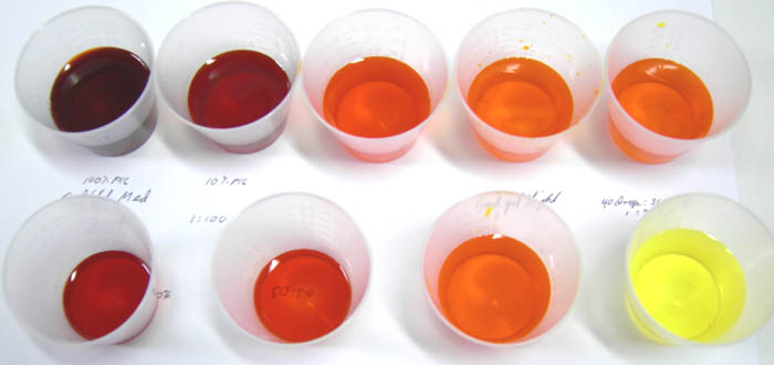 |
THIS IS WHAT TRANSPARENT INDIAN YELLOW LOOKS LIKE. IT'S CLEAN AND BRIGHT. 5-20-10 Today, 8-15-13, I have 3 Tartrazine yellow palette, a dark, medium and light mass-tone, they all will make a brilliant cadmium light yellow hue.
|
|
RCW#25 transparent cyan and opaque red RCW#7 are opposite colors. By using similarly-numbered blocks of these wedges to represent pairs of complements they will make neutral-darks when mixed.
36RCW#25, CYAN TO DARK BLUE matching the printed RCW #25.0 cyan = 40% mass-tone intensity in a clear media + 00% ult. blue.
#25.5 blue hue = 40% intensity of cyan in a clear media + 60% blue #19.5
36RCW#19, (FRENCH ULTRAMARINE) BLUE TO NEUTRAL DARK
#19.0 = French Ultramarine Blue
36RCW#1, YELLOW TO DARK BROWN
Hooray for Iron's opaques and Nickel Azo's transparent oils and Tartrazine Azo for water-based paints. Congratulations to the winners of the Yellow Color Award from the RCW. I know it's been done before by the Byzantine's in the Dark Ages during their First Golden Age of Byzantine, Pictura Translucida paintings but these winning pigments are permanent and tested in buon fresco. So there are many ways for yellow to reach brown when you include the transparent and opaque yellows plus the dual-toned transparent browns that tint to ochers and yellows. |
ACCURATE SPLIT-COMPLEMENTSThe 36 "real color wheel" will give you accurate split complements. Between #1yellow and #19ultblue there are eighteen 10° spaces on each side. From one to nine colors on each side of the opposite color makes the designers' split complements. Expect perfection; it happens all the time in nature. |
DON'T EAT THE PIGMENTS
Check a box of strawberry Nutri-Grain bars sold in America and you will notice that the treats
contain synthetic food dyes like Red 40, Yellow 6, and Blue 1. Shoppers on the other side of the
pond buying the same products, however, will see that their bars get their colors from
all-natural beet root, annatto, and paprika extract. As a consequence, the Kellogg Company,
Kraft, McDonald's and other American companies that do business in Europe use safe, natural
colorings there but harmful, synthetic petrochemicals here in the USA.