
7-3-10, I started on plain paper, I thought I would just draw but soon added water color and wrinkled the paper. This was drawn with pencil, the next painting on fiberglass paper was drawn with charcoal which has some big advantages I wasn't aware of. Water on the charcoal drawing does not turn it into paint like water does with graphite. Imagine that, after 10 years of only painting water colors I found a new trick of the trade 20 years later.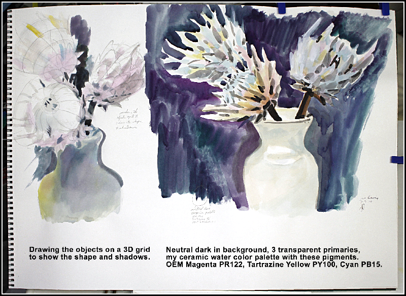 |
| 7-4-10, I've been working too hard, too many irons in the fire. While I was making the white paint I was painting this 3 color 7.5x11.5 watercolor and a smaller 3 color 5.5x7.5 one. The smaller on being on thinner paper buckled and I just soaked it like I did for the 300# paper. That Was a mistake, I lost color. For now, I had forgotten the 7.5x11.5 one and took down the set up. I was working on another small one when I came across my unfinished 7x11 drawn with charcoal. Now what? I'm committed to the new small one, that's it (writing to myself), that's it. The 7x11 will just have to wait. That has to be an advantage for painting dried flowers. |
|
Two days later, 12:00 6-30-10 I'm back working on the little one #965, Wow did I ever ruin that one. After I signed it and before I photographed it. The paper was 140 Arches, I taped the top and bottom but it still buckled. I soaked the whole thing and my whites washed off. The lime clogs the paper pores and stays on top, that's why it's such a good color blocker. This is not a detail. I should have straightened it with a steam iron. How much color I lost is obvious when you look at my signature and the paintings number #965. They were both the same color before I soaked it to flatten the paper. If the paper had been rag instead of fiberglass the color would not have lifted. Notice the white paint making this a gouache painting. 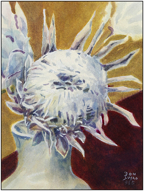 |
6-30-10, 10.30pm, #966 on drawing paper is drawn, quartered on a circular grid and the length of each petal marked as a dot, the actual background is black velvet. The cropping of the painting is extreme, Two flowers with petals leaving the painting and the total background equaling a third of the area. 7-3-10, Day 1, 5.5x7.5 watercolor on Arches 140#, Starting the second small one that I will frame, #966. I'm going to use up this 140# paper now that I live a block away from an art store that carries water color paper. It wasn't that long ago that I had to order anything I wanted from the mainland. This water color is painted with the 3 transparent primaries only. The protea is a double helix design. That means it's like two opposing screw threads. The dots in the drawing are the points of the dried petals. Drawing is very important to an accurate painting. The dark section at the bottom with the yellow is just the start of the dark background. 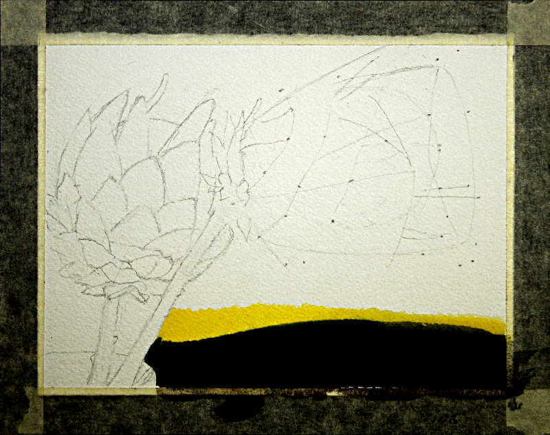 |
|
7-4-10, Day 2, 5.5x7.5 watercolor on Arches 140 lb. #966.
This water color is painted with the 3 transparent primaries only. The two blue strokes at the bottom are just testing one stroke of an opaque tint over a dark color. My opaque white is 4 titanium, 1 PH neutral lime and 5 gum Arabic and it works perfectly one_opaque tint stroke covers completely. It's because of the white neutral ph lime that I added, it fills the pores of the paper so the paint color sits on top. 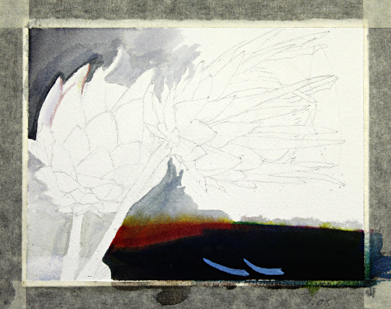 |
Day 3, 7-5-10, There is no doubt that painting with only 3 primary colors takes a lot more time in some cases. This is an excellent example of three color painting, pale colors at their best.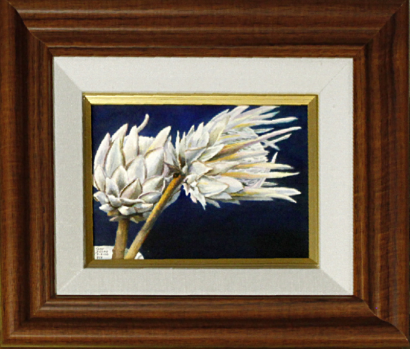 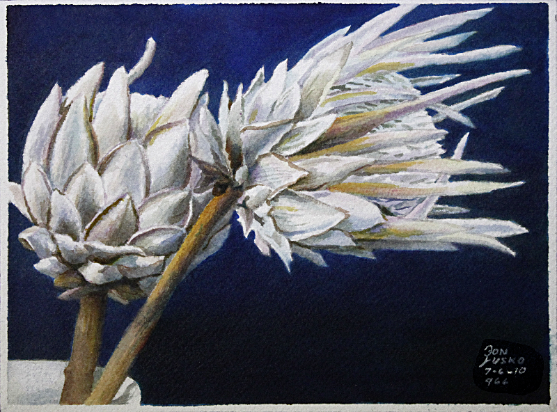 |
|
Today is 7/9/10 {:^)>
On this next painting I'm applying paint on top of the charcoal drawing instead of a pencil drawing. I just painted in the pattern outlines over the charcoal. Usually I would paint outside the graphite line to prevent it from becoming black pigment. My outline color is bt. Sienna. Well to my delight the charcoal just wiped off with a shammy when everything was dry. W0W, what a great feeling. It's so much easier to do the drawing with charcoal or wet turpentine. And the charcole residue just soap erased off never even leaving anything on or under the painted lines. It was really clean. This charcoal drawing for water colors only ereases easily from fiberglass paper, it won't work on normal water color paper like Arches. |
|
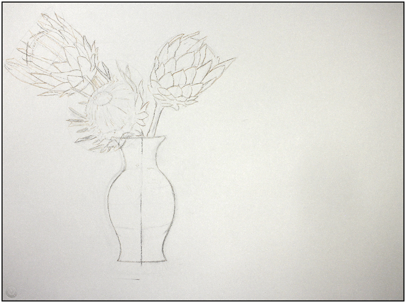
30X22 4 Protea 2 Vases, 3 colors plus bt umber and ult blue. (because of the fiberglass paper) Horizon line on the cotton-fiberglass Aquarius paper.
There is a warm white in the vase and a cool white in the protea. The warm colors completely surround the silver-copper colored dried flowers so I'll use a warm dark-cream wash the color of the vase. That's the local color. I'll leave out color on the highlights on the vase. The shadow on the vase's top is a cool blue/side pale shadow color. This is a great color combination, nature so perfect. An equal pigment mix of any two complements will make a neutral dark color that could lean either way becoming the shadow color for either color. YELLOW and blue. Yellow gets browner as it gets darker like the iron and titanium elements, i.e. the yellow oxide to brown oxide colors. Combining the darkest simi-transparent yellow-brown/side pigment, raw or burnt umber, with the complementary color ultramarine blue makes a neutral black. MAGENTA and green get dark as in the the simple quartz crystal, any equal color value from either color will make a neutral dark or neutral gray. CYAN gets darker like the sky at mid-day 12:00, it gets darker and warmer by adding magenta. Dark blue overhead and cyan at the 3:00 horizon line. The cobalt blue hue is at 1:30. Cadmium red will make cyan neutral dark, add magenta to make an ult. blue hue. Everybody should paint one full color wheel with just three pigments to understand how physical colors relate. All of the State's School Standards for color teaching should be changed. Five year olds should be taught with beet juice for magenta, saffron for yellow and iron ferris oxide as cyan. Five year olds can make any color they want. The colors won't last forever but they are safe to ingest. If you know of a cyan plant we could use tell us about it on my Comment Blog. Indigo is not processed to pure cyan anymore. Drawn with charcoal on fiberglass paper, blotted with chamois or dusted with a feather. 6-28-10, 8:00 pm, The first ocher wash is down, I'm letting it dry.
4:00, 3 color only, drew with charcoal, pale lines on charcoal outlines. It's dirtier than light pencil lines but it's application is accurate faster. The charcoal cleaned off nicely. The paper is cream colored, I applied a wash of titanium to the highlight side of the middle flower as a color application test. This paper with very little size or no sizing and is very unforgiving. Very heavy staining. I can't pick up a chemical color. I can cover it with one stroke of titanium & neutral lime or mix it with a transparent pigment to make it any opaque color. For a very fast color mixing palette I use eight accompanying colors for a really brilliant palette. Burnt umber, yellow oxide, bt. sienna, red oxide, ShinHan Opera magenta, ShinHan bright rose magenta, ult. blue and phthalo green Y/s. The 3 color palette takes longer to mix and match your colors but it's like egg tempera, slow and beautiful. This painting is 3 color plus brown, blue and white. Drawn in charcoal on fiberglass paper.
 Clean off the charcoal on the paper with a shammy and soap erasure. This fiberglass Strathmore Aquarius ll 22x30 paper soaks in so much of the paint, these nano-sized/colloidal chemical pigments/dye colors soak in paper unlike opaque umbers and ultramarine blue which are denser colors and stay on top of the paper. Opaque white with dense neutral lime pigment along with titanium pigment clogs the pores of the paper quickly allowing the titanium to be opaquely white in a single stroke. Make your own permanent transparent primary pigment watercolors and permanent white opaque block-out. The color pigments came from Spectra Colors Corp. in New Jersey. ShihHan of Korea makes the Rose Bright (excellent magenta) and Opera paints. The lime white has a neutral PH, it's not a standard pigment today. It is used by boun fresco painters. You can make you own lime white or buy some Bianco Di S. Giovanni white from Zecchi of Firenze, that's where I got my fresco supplies. Of course Titanium works in fresco also, in fact it's easier to mix your tints because it doesn't lighten as much as the lime paste when it dries. I hope someone jumps on manufacturing this new white watercolor paint quickly, it should your white because it doesn't sink in like the nano sized particles of titanium white do. Painting is always a learning experience, that's part of the excitement, always test. The blue vase has a lot of testing.. It's a test to make blue from the primaries and compare it to the pre-made ultramarine blue which is the stroke in the middle of the widest area of the vase. It's a test on the left side with a thin wash of white and Opera mixed. |
|
Today is 8/14/10. It is now 9:58 PM In 35 years I almost have 1000 numbered paintings, this is #969, 4 Protea and 2 Vases, 30x22 Ultramarine blue and the very dense burnt umber will make the blackest neutral, filling the pores and staying on top of the paper. I have added them to my palette. My opaque white is also there. I used the white to lighten up the primary neutral gray so I could paint the background in one stroke instead of the several it would take with using only the transparent chemical colors. 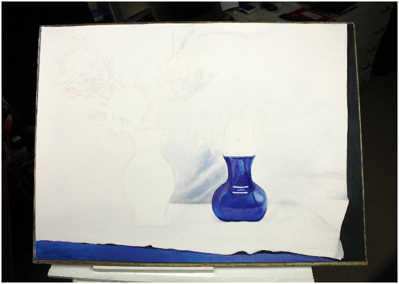 |
Next is a test of a single stroke of white on top of the blue. The two white paint strokes are the 45º and 120º strokes next to the untouched "paper" white horizontal reflections of the two florescence. One stroke of my Opaque Block-out White is all it took [:^)> 8-14-10 IMAGE BLUE VASE finished, protea 1/3rd finished, one stem on cream vase. 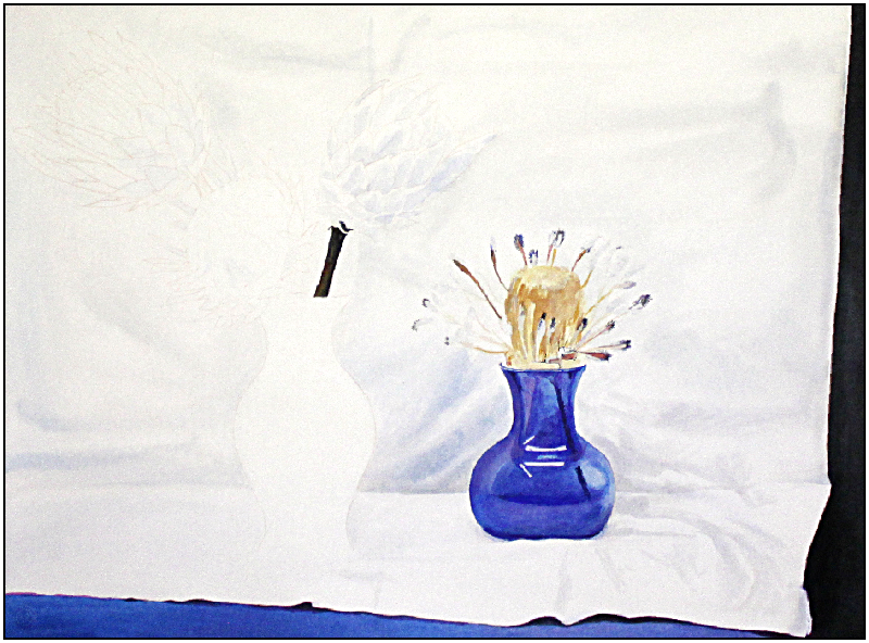 |
|
I can't wait to finish this one, this paper is the pits. The pale vase is almost finished, I'm waiting for the paper to dry. Ok, it's dry now, luckily it dried flat. Just because the whole setup fell over after the drawing was finished I have to re-assert the remaining protea. The small insert shows the new drawing with charcoal lines instead of using a medium-hard pencil. TIP: The charcoal was removed with a kneaded erasure, it worked perfectly. This makes watercolors faster on this crummy Aquarius paper. The King Protea's go from warm on the top left toward the warmer fluorescent and cooler to the right. That means the warmers side got a wash of yellow while the right bottom got a blue wash. Then the deepest darks.
Today is 8/23/10. It is now 1:22 AM. My appreciation for this paper is growing now that I understand how to erase. Change any color any time by scrubbing down. I love that. The RCW three transparent primary pigments are all small molecules and they sink into this fiberglass and cotton paper and lose intensity. My opaque's, lime/titanium white, burnt sienna, burnt umber and ultramarine blue are larger particle pigments that stay on top of the paper and keep their intensity so there is another dimension in this painting, color depth in the paper between transparent and opaque colors. Holbine and ShinHan make Opera magenta color with PR122 in it, it makes the brightest red and could be used exclusively in a 3 color palette, except you will still need pure PR122 for the darker values of the pure color. One step forward, one step back. Search "Paint War" to follow pigment and media popularity winners through history. 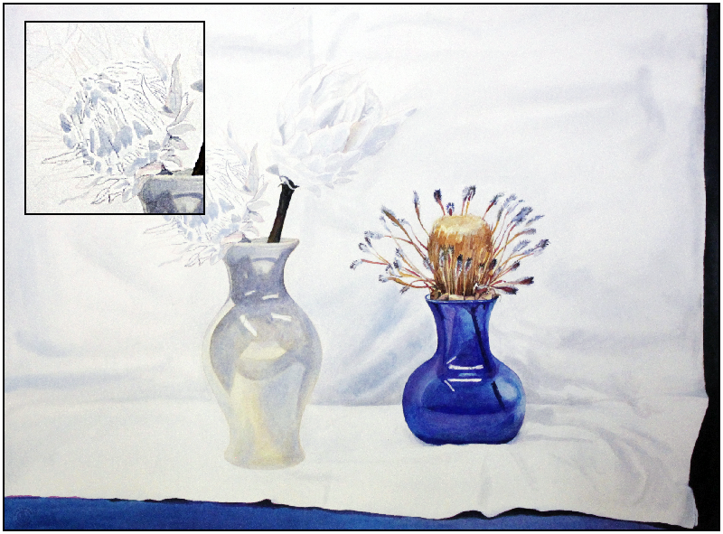
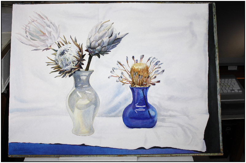
I think the second protea is finished enough for awhile and I'm starting number three. There have been two ways I been painting 3 color paintings. Yellow first, magenta second and cyan third or mix the color first, sometimes adding white. It's nice too have it both ways. I'm not using red oxide at all so I removed it and put Burnt Siena in it's place in the second well along with yellow ocher. That will leave me with in Well#6 ult blue left of well#1 yellow, in well#6 Ult. Blue is in the opposite corner of brown with cobalt blue under them next to the white well. Well#2 has yellow oxide next to transparent yellow and Burnt Sienna next to Well#3 transparent magenta PR:122, . Well#4 has four colors, Thalo Green PG36 along with ShinHan's Opera, Bright Rose and Bright Violet. Well#5-Cyan PB15 only. Bright violet might be the first color to go but it makes such a bright blue mixed with cyan. They are all staying there for now.
9-1-10. Rounded the blue vase top, finished the pale vase top edge, working on the proteas for another 6 hours.
Fresco is still the fastest accurate representational medium because you can change from black to white in one stroke. Click that link if you want to do a fresco. Click this link if you want to see how I did a large 3 color transparent primary pigment only, buon fresco mural. Today is 9/11/10. This past week I've been working on a 22x15 oil painting on my friend Julie's porch at the 2,000 ft. elevation. I'm painting her flowers and the West Maui mountains. This view shows one of the ancient myth's of images in the mountains. Early Hawaiians had stories to go along with these images. At this elevation I conceder this mountain it to be looking female as she will be at 7,000' and sleeping alongside of the Sleeping Male Giant. At sea level it is definitely the King with his helmut on, but good points could be made for her breasts. These stories would be passed on from family to family as they walked or sailed to different parts of the island. I don't have a drawing to go with Bird Island as the simularcrum Tongan defeated king. This is viewed on a narrow road to Hana while you have started to enter a new valley. No place to stop. It's like the Haleakala Bus-man's Heart which is only visible in one road turn and the morning tour bus men know where it is to point it out. 9/18/10. I took the weekend off from the oil painting I'm working on in Pukalani and am working on painting this page is about.
10-5-10, The Pukalani painting took much longer then I thought it would.Yesterday I finished it #968. The painting is about the King and Queen of the West Maui Mountains. That location ended up being the best location, both mountain figures are amazing. That is another page for my Maui Magic Coloring Book except all the other pages were drawn and printed before I used one of the pages to paint in. I'll have to work backward and do the drawing last. Will I ever get around to it is the question. Here is the finished 30x22 water color, 4 Protea 2 Vases, #969, 10-9-10 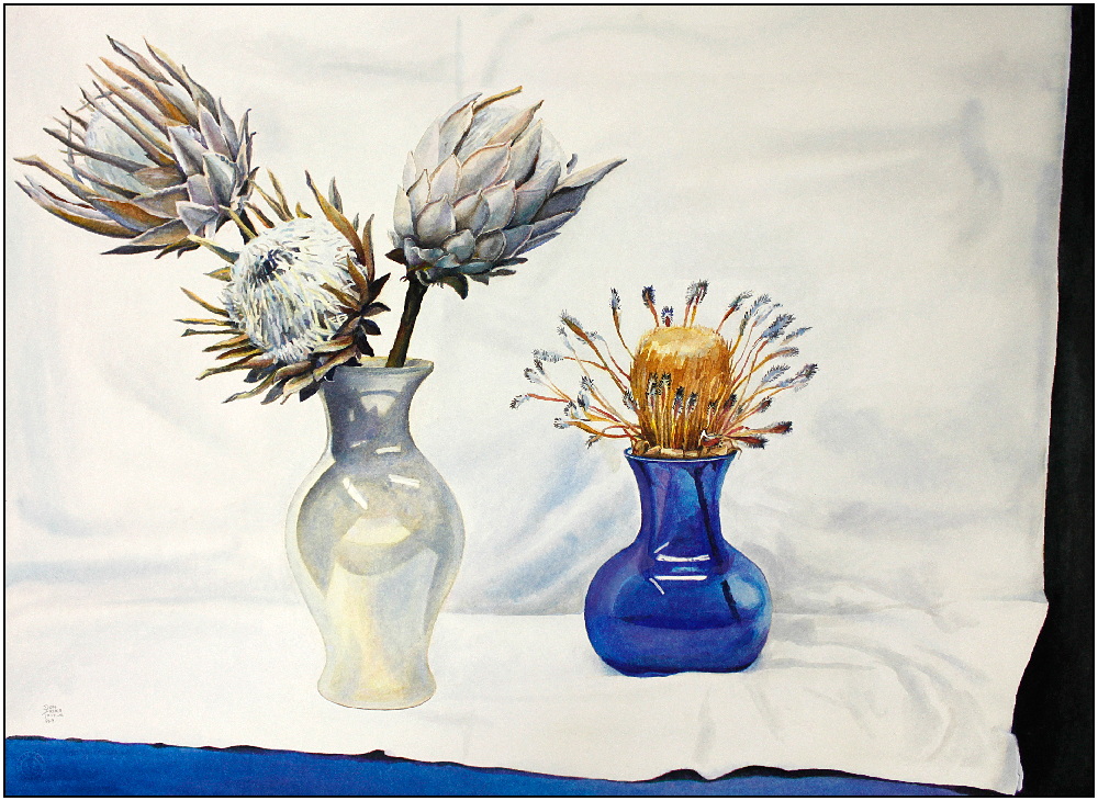
|
NEXT: Artwork of a Florida RCW teacher, Christopher Cardot, christopheRCWpainting.htm
PREVIOUS: Oil, the King & Queen of West Maui Mountains, pukalanijuliehouseview9-2010.htm

|
5-20-11, According to http://urlpulse.co.uk/www.realcolorwheel.com my site is worth £11,574.6.
The estimated 819 daily visitors, each view 2.00 pages per session.
It is hosted by Omnis Network Llc California Torrance, United States, using Apache/2 webserver. You will find content about: Full Color Course, Human Proportions, Elements, Links To All Oil Paintings On Location, Coloring/painting Book, 01 Bananas 66, Acrylic On Location, 03 Haiku Wet Rd, Pastel, and 15x22.
Realcolorwheel.com has a rank of 214456 in United States, with an estimated 36840 monthly visitors. Click to view further details of it's valuation report. bizinformation.co/www.realcolorwheel.com - Cached Of the 1,000 top rated sites in the world, Real Color Wheel is number 38, 2014. How to Use the Real Color Wheel: 3 steps (with pictures) - wikiHow
Nov 24, 2010 ... wikiHow article about How to Use the Real Color Wheel.
wikihow.com/Use- the-Real-Color-Wheel.
|