

|
|
|
|
|
|
|
|
|
|
|
|
||||
|
|
|
|||||
|
|
|
|||||
|
|
|
|||||
|
|
|
|||||
|
|
|
|
|
|
|
|
 |
|
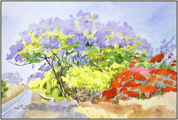
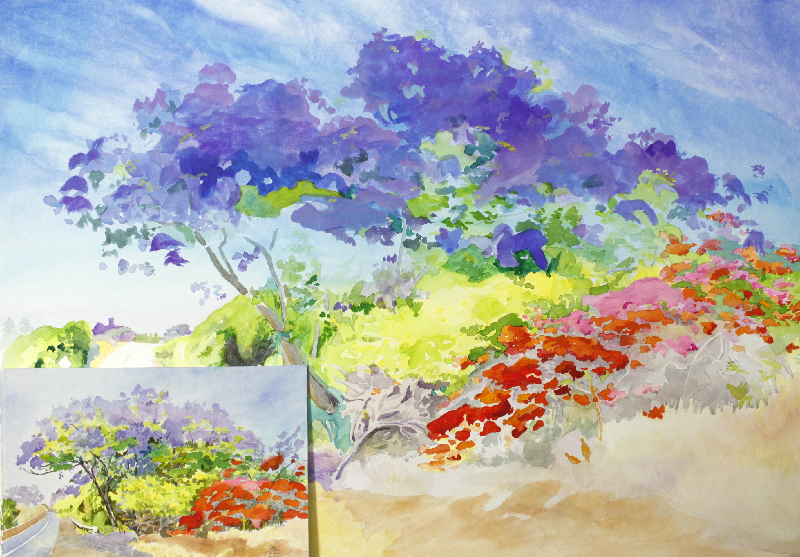
Day 1, I should have used a single fairly large pattern of the tree's outline and left it white while I added a wet sky all around it and let it dry so the colors won't move. Put the flowers in second along with the tree trunks and let it dry again, than added the remaining sky and branches.
I did it backwards and I'm forced to go opaque early in the painting. I wasn't ready for the big jump to a 22x30. I should have done another 1/2 page warm-up. 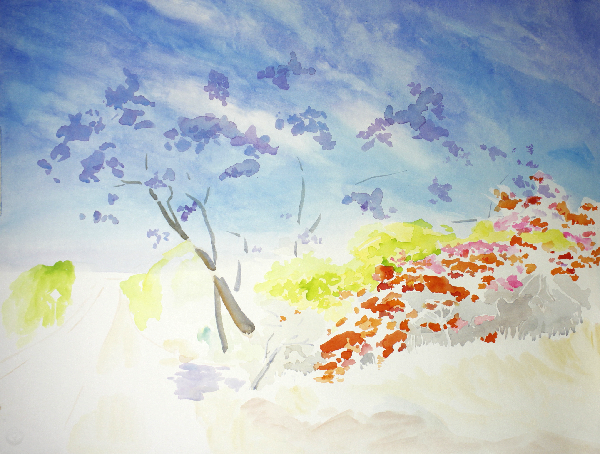 |
|
Day 2, 6/4/10, Big strokes with my newly made opaque colors in my butchers tray. Very good dry, the same color as wet. Good coverage completely blocking out the under painting. I'll have to refine it but this white is made from 2 parts Champaign chalk, 1 titanium, 2 zinc, 5 drops gum Arabic, 6 drops soap, 6 drops of honey.
Nope, it cracked, use more honey. Try Bianco Di Giovanni Lime white and titanium and zinc. 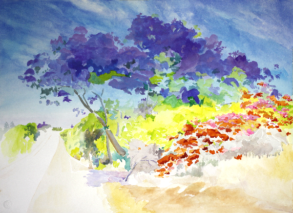 |
Day 3
 |
 |
|
6-5-10, 1pm to 4pm.
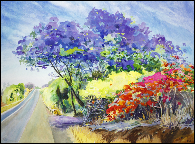
I got asked to move my van today because of a possible problem of a car not being able to see on-coming cars around me. This may be a big problem, not being able to get back to my original location unless I sit outside in the sun. My skin can't take the sun anymore, my forearms brake out. The opaque white is working just fine. Now it's closer to being like acrylics where I can go over mistakes with white and start over. I still have a lot to learn about switching between opaque and transparent paint, maybe "learn" is not the right word. I already do it with fresco, oil and acrylics. It's just that I never used gouache before. Now I will be combining transparent and opaque water colors. I think I like it and why shouldn't I? Classic transparent painting is more difficult because rigid pattern outlines have to be adhered to. Gouache, like oil paints, paints opaque colors over any color. Sometimes gouache and transparent water-colour are found together in the same painting as in the work of the earlier miniature painters and in many transparent water-colours in the nineteenth century, such as those of F. L. Lewis and his contemporaries. The latter were done for reproduction and opaque is fast for corrections. In this painting the opaque purple colors blended with smooth transitions that worked fine in the purple flowers. My problem was that the large variations in the colors of the sky would show up through the transparent purples. The opaque purple colors fixed that. The red flowers are all transparent colors. Transparent colors are more vibrant than opaque colors. Here is the most extreme example. Cadmium Red Light is the brightest red, Opera Magenta transparent and
Tartrazine Yellow Transparent mixed together make a more intense red than cadmium red. Transparent colors can be painted on top of opaque dried white.
Now I have to ask myself, did I subconsciously plan this error or was I just out of practice considering all aspects of location painting. It is an art within the art.
7pm, I'm testing pigments to make the formula for opaque block-out white. Zinc paints very translucently and dries white. White lime is also very powerful and paints translucent to transparent but dries white but not as white as zinc. Doesn't need much gum Arabic as transparent yellow does. Last but not least, titanium, it covers best, dries the whitest, paints opaque, There is no reason to include any other pigment. A lime filler might be nice. Tomorrow I'll go out and white out the area I made the mistakes in and paint it in again. Now if this works I have a real good product. 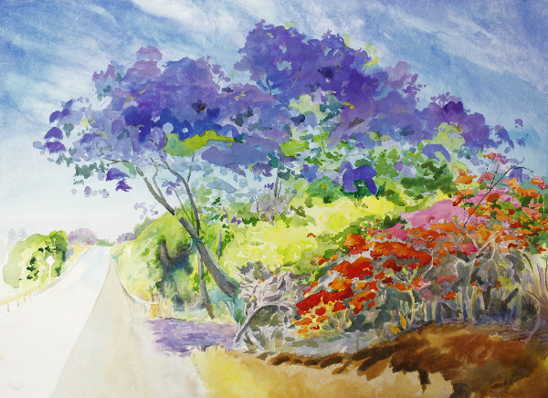 |
|
6/8/10. It is now 11:14 PM
The assets of this clear transparent 3 primary painting, plus the white opaque color to cover mistakes, and make opaque over-painting colors, are going to have to fight for survival on their own. The white paint is coming along well. Tonight I made some 10 titanium, 5 gum Arabic, 1 soap and some honey, I have to stop this cracking problem. 1 titanium is about a fat 1/4" ball a little less gum Arabic, 1/2 of 1 drop soap and 2 drops of honey worked well, no gloss on the paper, no cracking cake. It works, any color can get colored white and a new color can be added. Everything from the transparent first wash to building up to full color to switching to opaque gouache all in the palm of your hand. 6/10/10. It is now 11:00 AM
6/11/10. It is now 4:15 PM, I would like to finished this 30x22, #964, today and get the white made, then shoot the photos of the butcher trays. 6/14/10
 |
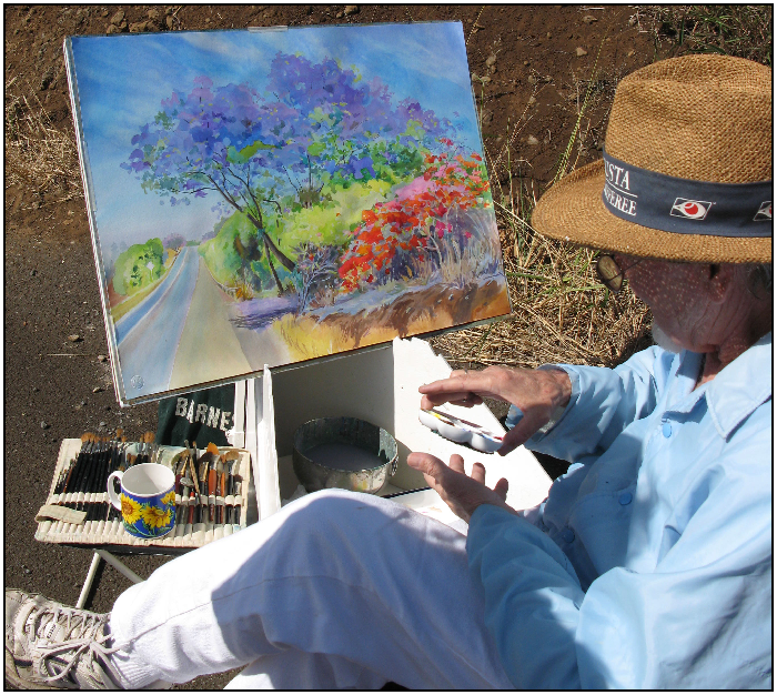
That's me below with the 3 color palette in my hand, I just turned 69. A beautiful stranger came by and took this picture and brought me that cup of water. Her name was Kate, wife of an abstract painter named Tony. Nice people. They had just bought my colorwheel at the best art store in Hawaii. UpCountry Art Supplies, Maui.
 |
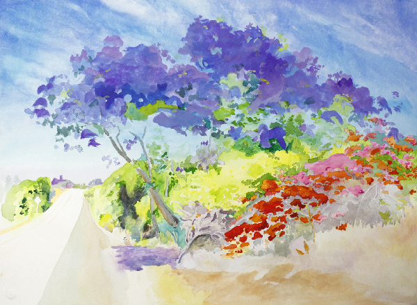
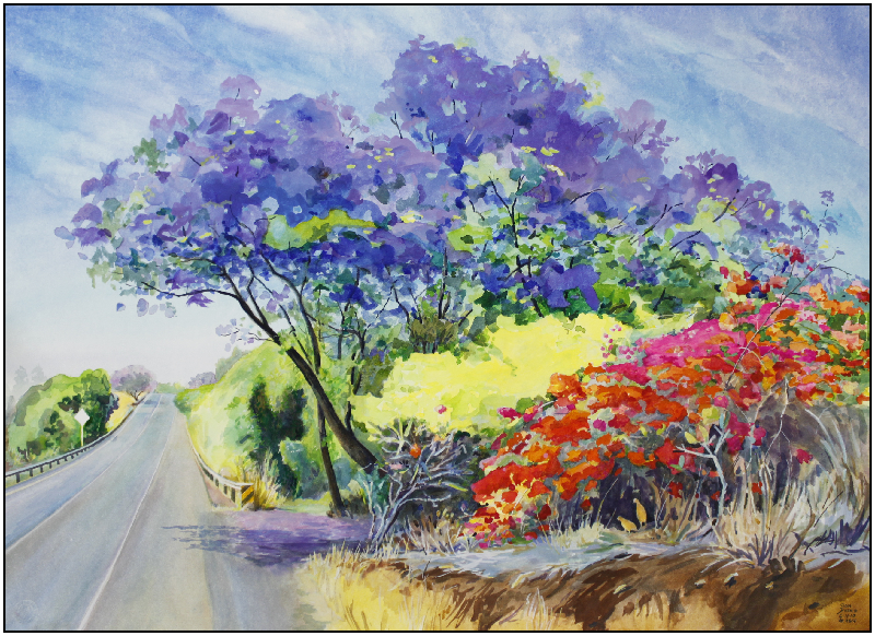
| I have neglected the left side of the page, it needs some road and fence work. Now that I have given up the classical aspect of the water color on this painting I am free to use opaque colors. I've been making an opaque white now to go with the primaries. It should come in very handy.
These two butcher trays are showing the mixing power of Opera magenta for making red, orange and blue. Not that PR1:22 quinacradone magenta won't make red and blue but Opera made with PR122 makes them more brilliant than the pure tube colors or the printed page. These three water color pigment colors and the giclee ink colors are one and the same, both capable of making a full color image. This page should mark the end of the "Red-Yellow-Blue" color wheel theory, good riddance, it's been confusing people for 100 years and never worked. I have been working on colors of the silver element on a colloidal silver page. Silver makes scarlet-crimson colored crystals which is just short of magenta and yellow to scarlet-crimson colloidal silver water. Here are the colors on my ceramic 3 primary color palette spread out on enameled butcher trays where I mix my colors. 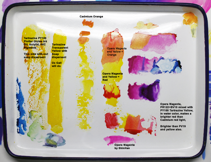 |
| This is what I added to my 4" palette for large paintings. Since I use a butchers tray to mix colors I could add the colors that I use most often to the palette, like ult. blue, Cobalt blue, Burnt Umber and Burnt Sienna, yellow oxide, red oxide, Thalo green and Opera. Is this cheating? The only reason they are added is for speed. I can match any of the colors with just the primaries but I use these colors a lot.
These added eight colors are nothing compared to the number of mixed colors in this painting. All of these colors can be matched using the transparent primaries, these pre-made colors just save me mixing time. Painting with only 3 colors does take more time but everyone should paint a full color wheel with only 3 pigments at least once. 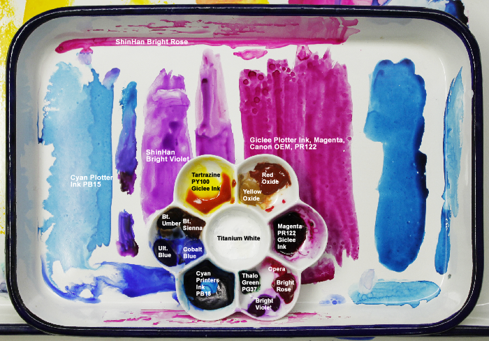 |
I have been working with my opaque white, here is the final pigment to gum ratio. 4 titanium, 1 lime pigment, 5 gum Arabic. It's very good with high covering power, one opaque tint stroke covers completely.
 |
THIS IS WHAT PERMANENT TRANSPARENT INDIAN YELLOW SHOULD LOOK AND BEHAVE LIKE. IT'S BETTER BECAUSE IT'S CLEANER, BRIGHTER AND MORE TRANSPARENT THAN ANY OTHER DUAL-TONED W/C YELLOW ON THE MARKET TODAY. 5-20-10
 |
NEXT PAINTING, 5 Maui painting I never recorded, tomsdriveway-pierosview.htm
PREVIOUS PAINTING,
Painting with the 3 Transparent Primary colors. (3 paintings), Jacaranda2010MakawaoPO3color.htm