|
Maui On Location Gallery 1 with painting tips Gallery 2, Gallery 3, Gallery 4. Gallery 5. Biography. 4 Videos of Location Painting. Household Cylopedia, 1881, colors of paints & inks. ARTISTS, dated history, pigments, color theory, techniques. LOCATION, all media, human proportions, perspective, modern techniques. COLOR, B.C. to A/D pigments, RCW, crystal chart, elements, minerals, ores, rainbows, prisms. HISTORY, comparative advances in art, European and Asian Cultures, 8000 B.C. to 1912. MEDIA, grounds, oil, acrylic, water color, wax, cera colla, casein, fresco. Coloring Book, pattern outlines, aerial perspective palette.
This documented painting took 8 days with the camera rolling. Edited to two hours. I explain why each acrylic color choice is used on my palette and where to place each color for advantageous mixing with white in the center. I made a palette to store acrylics wet for a month, it can be held flipped opened and closed with one hand. Just a box with a lid. The lineal perspective drawing technique for accurate object placing is explained. The painting tips come as I'm using them. Don
Techniques in drawing and PAINTING ON LOCATION using oil, alkyd, mastic, watercolor and acrylic paints. How colors and mediums were historical made. Useing an aerial perspective color palette that matches pigment colors from the foreground to the background. Use transparent Yellow, Magenta, and Cyan colors in a 3, 6, 12, 24 or 36 color color wheel used without black pigment to paint dark shadowed colors matching light, pigments and nature. Crystals show how different hues become dark, this is the basis for the real color wheel for artists. All tube colors match this color wheel in a logical order that shows all the correct pigment color oppositions to make dark, plus their correct split-complementary oppositions. Also in this section are human proportions and lineal four point perspective examples. ---30/ CLEANLINESS IS NUMBER ONE 197 ---PAINTING SURFACES 199 ---BRUSHES 200 ---32/ ACCURACY OF LINE, HORIZON, TRIANGULATION, PERSPECTIVE, REFLECTIONS 203 ---PLACING THE IMAGE 205 ---LINE OF SIGHT 206 ---LINEAL TRIANGULATION 207 ---DRAWING THE IMAGE 208 ---PERSPECTIVE 209 ---TERRESTRIAL AND ASTRAL VANISHING POINTS 211 ---PERSPECTIVE TOOL 212 ---REFLECTIONS 212 ---33/ EDGES, CONTRAST 213 ---SKY, EARTH AND SEA GRIDS 215 ---34/ INDEX, CONCENTRIC RINGS AROUND YOURSELF, GRIDS, AERIAL PERSPECTIVE 216 ---CONCENTRIC RINGS AROUND YOU 217 ---AERIAL PERSPECTIVE 219 ---35/ THE REAL COLOR WHEEL [RCW] In pigments 221 ---The REAL COLOR WHEEL main page ---TRANSPARENT AND OPAQUE PIGMENTS, PIGMENT TERMS 228 ---COLOR IN ELEMENTS 231 ---PIGMENTS IN OIL 233 ---MY PALETTE IN OILS with RGB HTML COLORS SHOWN233 ----THE BUYING ORDER OF OIL COLORS 235 ---MEDIUMS. 240 ---MASTIC MEDIUM 240 ---OIL MEDIUMS 240 ---PRE-MADE OIL MEDIUM 241 ---MAKEING YOUR MEDIUMS 241 ---ACRYLICS 243 ---WATER COLOR PIGMENTS 244 ---LIGHT AND SHADOWS 266 ---THE COLORS OF WATER 269 ---WATER GRID 269 ---WATER DIAMONDS 269 ---WAVES 269 ---39/ HUMAN BODY PROPORTIONS 272 ---HEAD 272 ---SIDE VIEW, HEAD 272 ---FRONT VIEW 272 ---THE BODY 272 ---THE DRAWING ORDER OF A STICK FIGURE, TO CATCH THE ACTION 274 ---PAINTING CHAPTER #40 280 ---40/ TECHNIQUE 280 ---WATERCOLOR PAPERS 281
30/ CLEANLINESS IS N0. 1 196 The first topic is cleanliness, it's the very important first block to building a painting. It's important for health reasons also, metal pigments are heavy and can't be eliminated from the body, so it's an accumulative poison. The Romans liked the taste of lead, it sweetened the water and wine. When painting water colors, keep the water clean. If you can afford it, add a bit of ox-gall to the cleaning and mixing water, it will reduce the surface tension and increase the color flow. Wash the size off the paper with this water also. In oils, keep your colors clean by mixing them with a palette knife instead of your brush. Cut paper towels is into 3 inch squares, these will be used for cleaning, and when folded into small triangles will apply paint in the early painting stages, especially when your working in oil where cleaning brushes takes time and materials. In water painting they will blot paper back to white, in the early stages. Always put the cap back on any tube of paint right away. Keep the tube clean. Keeping your colors clean also includes the consistency of the pigment. Dependable viscosity will insure a complete stroke every time. You need that guarantee to trust your brush. When painting in acrylics I use a jar white instead of the tube white. Since we use so much white, the jar white has the right consistency. Use accurate measurements in your oil and fresco mediums. I clean dried on acrylic brushes with isopropyl alcohol.
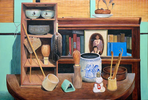
PAINTING SURFACES My painting surface of choice is thin linen, acrylic gel glued to 1/8 to 1/4 inch beech or mahogany plywood, primed with acrylic gesso. I like one standard size for all mediums, the water color standard, 22x30 is my choice, it divides into five classic sizes. Photos of making panels
to paint on, getting started.
HEMP MAKES THE STRONGEST CANVAS SUPPORT Stretching a Canvas Hemp, Linen and cotton fabrics shrink while drying, for larger painting sizes do as Fredric's does, pin the fabric down and apply the gesso with a spatula. Two to four coats will do it. Then stretch the canvas. Applying the gesso on a stretched raw canvas will work on 24x36 and under, but will bow the bars on larger paintings. 4 acres of hemp is equal to 1 acre of forest to produce the same amount of paper. Hemp pulp paper can be recycled 20 times compared to 4 times for wood pulp paper and it requires 60-80% less chemicals to produce hemp paper than wood pulp paper. Hemp has a growth rate to maturity of approximately 2-3 months as compared to approximately 80 years for a coniferous plantation. The lumber industry and the petroleum industry conspired to outlaw alcohol as fuel and hemp as paper. Choosing the best W/C paper for the job. Waterford 300#, hot pressed and cold pressed are excellent. Twin Rocker 300# is a great new American company everyone should be proud of. Strathmore makes top flight water color papers, Gemini 300# rough and cold-pressed are my favorite. Arches 300# belongs with this esteemed group. To prepare a surface for acrylic and oil. I use pre-made Fredric's
Acrylic Gesso when I can get it, it has the best consistency. Three or
four sanded coats, thick, thinner and thinnest is the way to go. Use a
foam brush for the smoothest application. The thinnest layer should leave
no brush marks, it requires very little dry sanding with #220, wet-dry
sandpaper, always sand with a sanding block. The final ground is as smooth
as possible so it won't make unwanted textures, go for the gold.
BRUSHES The first tool on your oil or acrylic painting is gray chalk on a white primed support or white chalk on a colored ground, it dusts off easily with a feather. Use a good grade of pastel so it won't scratch your painting surface. I paint in my outlines with thin Ultramarine Blue or Yellow, whichever is appropriate, then wash off the chalk before adding the local colors. Here's another starting method for oil that is BASED ON THE WATER COLOR TECHNIQUE that goes like this. With the top and center reference marks in place and the left and right object reference points dotted in pencil. Wash and wipe down the 300# paper with a 3-5" elephant ear sponge. Before the sheen leaves, start adding color with the sponge, don't overwork it, just get a 100% coverage as accurate and as bold as you can and let it dry. Those colors will be set after drying. In oil you use a small triangle of gauze or good lint free paper towels, the cheap one's won't shed. Wipe on the big colors with a medium of 1/3 Venetian Turpentine, 1/3 Sun Dried Linseed Oil and 1/3 Dammar Varnish with 2% drier. When done in this method every stroke can be used in the final picture if its needed, treat the original strokes like precious paint, let them show in the finished picture. BRUSHES AND THEIR TYPES, LET ME SUGGEST A FEW BRUSH STYLES I USE TO GET THE JOB DONE. Oil brush #6, Signet, Robert Simmons, Series 43, Extra long, is a beautifully cupped filbert hog bristle that holds it's shape. The brush goes from small to large under control. Use this brush to do the shadows and finish the first day's work. If you used 2% drier it will be dry in 18 hours, ready for the next day's work. If you use the new alkyd oil it's even faster and yellows less. The nylon brushes give deep texture at fluid viscosity. Great for wet in wet painting. In oils, most artists like the hog bristle hair brushes as their main workhorse. You may also, if you paint thickly and show texture in the paint. I prefer the texture of the subject represented in smooth paint. Here is my workhorse brush. Take your first used, #8 or 10 series #7 Winsor Newton water color brush and hammer the end of the ferule as flat as you can. Trim any wayward hairs and you've got the best acrylic filbert I've ever found. This is one of my main brushes, used in every picture. The next series of brushes is the bright and long flats, the longs make a longer stroke and the bright's blend and mix more. On W/C's I paint with a 3/4" or 1" long flat sable after the sponge. In oil I start with a 1/2" #14 Winsor and Newton series 807, long flat for a 22x30 or a 3/8" #12 flat for a 15 X 22. Also on hand is a #10, #8, and #6, these are very useful brushes. Raphael and Grumbacher also make a very good lines of flat brushes. The last stage of a painting is the calligraphy, it's done with two types of very long hair sable brushes. First is the pointed long script liner, the best is by Isabey, Series 6318, #12, #10 and #8. You can paint a whole picture with one of these beauties. The sooner you pick it up the better. A shorter hair brush of the same style for tight work is the W/N 3A, #3 Designer's brush, it's like a paint pencil. The last style is the round ferule, long, fine red sable, flat end, lettering brush. You will need #2,4,6,8, and #10 for long square ended lines, That's it, I use the same style brushes for W/C, Acrylics and Oils. The flat square end is prefect for details. Small, clean, well used hog hair bristle brushes, make great paint erasers for W/C's and 1/2" squirrel filberts make the best toning wash and glaze brushes for all mediums. Photos and discriptions of 200 favorite brushes. End of Modern Supports and Brushes
32/ ACCURACY IN TIME, HORIZON LINE AND LINE DRAWING WITH TRIANGLED MARKER POINTS, PERSPECTIVE AND AERIAL PERSPECTIVE.
1, Direct Incident Light is parallel and from the Sun. 2. Indirect or Clear Light is shadowless. 3. Shadows change in their interiors. Warm shadows cool interior, cool shadows warm interior. 4. Highlights reflect the sun or sky. 5. Reflected Light, is an angle of incidence of the sun reflecting back to you. 6. 'Local Color' is the main basic color of an object. 7. Chiaroscuro is the contrast from a single light source, real or perceived. It can be powerful. 8. Aerial Perspective, the color of air is an equal mix of Cyan and
Magenta, making Ultramarine Blue. Yellow is the first color to be absorbed
by air. The opposition colors for the distance shadows are Purple and green, a
split
analogous opposition. The far distance is Ultramarine blue in hue.
By using the other split analogous choice, scarlet and green, you will get a
warmer dark opposition then when mixing magenta and green's neutral dark. I find
this color combination more needed as a transparent dark used in mass-tone.
PAINT YOUR PICTURE WITH THE LIGHT FROM ONE HOUR OF THE DAY, NO MATTER HOW LONG IT TAKES. Cross-calibrate the position of the sun by finding the elevation off the horizon line in degrees and it's position left to right off the center-line with a clock face radiating grid. i.e. 40 degrees, 11:00. The sun's light is parallel, our perception of it can change. Standing behind a row of trees the shadows will seem to expand outward. Standing in front of the trees and looking back will seem to make the shadows converge. In the morning the main color oppositions are Cadmium Yellow light, Burnt Umber and Ultramarine Blue, afternoon colors tend more to Magenta and Thalo Green, evening colors are Thalo Blue and Cadmium Red. All of these oppositions mix to a neutral gray and darker shades. Diffraction enhances a painting rule of Tenebrism, "It's darkest next to the light and lightest next to the dark".
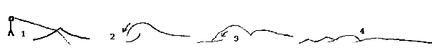
THE COLORS OF WATER This quote isn't really related but, "Relax, breath deep, imagine breathing blue skies in and gray skies out." 10 year old, Jade Pettyjohn. Here are the different colors of light I look for on water. 3. Transparent or Opaque water color. 4. Bottom color. 5. Shadows from the water, on the water. Water grids start from the horizon's center-line of your picture and radiate toward the foreground. These lines can bend to show the direction, elevation and movement of the flow, crossing these grid lines with wave lines that stop the action. A water diamond is a sparkle that is peaked at the top and rounded on the bottom. They form with their ends on the concentric rings around you. You are seeing directly into the water, at a 90 degree angle of incidence. If the sun were directly overhead these diamonds would sparkle with the sun's reflection instead of being dark. Paint them with a flat brush. WAVES
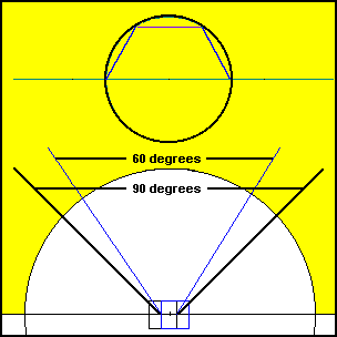
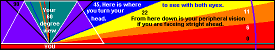
PLACING THE IMAGE Position your painting support directly below the scene, so the top of the painting is touching the bottom of the scene. The sides of the canvas support mark the sides of the image you are painting. Draw in a chalk center line and the horizon line first. Mark the support sides with reference points from the image. Measure with only one eye, your right eye, and keep your head at the same relative position to the painting throughout. Don't paint a picture of more than 90 degrees without two center lines because you will have to move your head from side to side to see the whole scene. Most paintings should be in the 60 degree area, you have that much undistorted overlapping vision. Compose the picture from what you see, if it's not perfect, move.
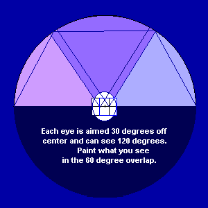
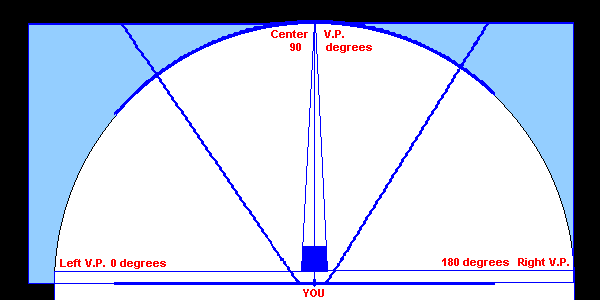
The horizon viewed at sea level with both eyes will appear almost flat because your focus with both eyes is on one point, shared by the view of both eyes and you have compensated it flat. You can't do that at higher elevations. At sea level the horizon line is 2 1/2 miles away, at 10,000 foot it's 200 miles away. Both eyes can see a total of 180 degrees, your eyes are angled in your head, not both facing forward. Each eye is angled off the frontal plane by 30 degrees, the overlapping view is 90 degrees, the least amount of distortion is in the center 60 degrees. Each eye can see 135 degrees, each eye can see 45 degrees that the other eye can't. The overlap of both eyes is 90 degrees, 90+45+45=180, your total view including your peripheral view is 180 degrees. The horizon line is curved, the higher your elevation the more the curve is noticeable. Astronauts see a sphere.
A MARKING POINT in the picture is an easily recognized still object or a crossing of objects, or a tangent meeting point of objects, they are easy to find at a glance. Find a marking point on the center line close to the horizon line as your center marker. This center mark can be on any distance away from you, on any concentric ring around you. Find left and right side scene marker points also close to the horizon line. The top marking point will complete the format of the final painting because the bottom is marked by the top of your picture. Distant objects are relative to nearby objects from your viewpoint through "linear triangulation". Start by making at least two triangles using obvious marker points joining and starting from one common marker point. Two more triangle marking points anywhere in the picture will connect to one of the existing points forming another lineal triangle, if you're using different lineal distanced marker points. If you used objects on a similar "concentric ring", you would have "plane triangulation", they work equally well. These triangles will insure the accuracy of the objects position.
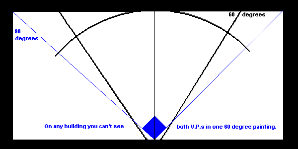
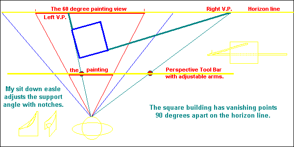
DRAWING THE IMAGE Draw with a piece of inexpensive school chalk, because it contains no wax or oil. Soft finer pastels are even better. On colored grounds use white chalk and on white grounds use a pale gray. Draw simple outlines on obvious concentric rings with chalk, the biggest patterns first, start on the reference points. Inside these big patterns show the texture with short directional lines. Simplify this texture with sparse, 1 to 10 representative lines of size, shape or direction. Before painting in the final outlines with a liner brush, dust off the loose and caked on chalk with a feather or soft brush. Paint the outlines in Ultramarine Blue or Yellow, whichever color is appropriate. When the medium is oil, thin the color with turpentine so it will dry fast. If you're painting in acrylic, thin the pigment with a little water and medium mixed together to give the film strength. The outline you draw belongs to the objects behind it, in the background, unless you're going with a darker foreground for contrast. Never let the outline show as a line, it's unnatural, use the contrast of the shape's color or intensity against it's background. Wash off the chalk before blocking in the local colors. Cover the first 100% with as little overlap as possible. Keep the wash graduations smooth so you can use any part in the final picture. The vanishing points of a square are 90 degrees apart on your horizon line. It's impossible to show two 90 degree vanishing points in a 60 degree picture. A 60 degree equilateral triangle held with a point under one eye will accurately mark a 60 degree picture on your horizon line. A book or sheet of paper will be 90 degrees, lay your painting support on the ground, place a corner between your feet and follow the sides leading to the horizon line, that's 90 degrees. Notice, the odds are good that you can't see both horizon line vanishing points in a 90 degree picture, and most undistorted pictures are 60 degrees. Compose the picture from what you see, if it's not perfect, move. Lineal Perspective is relating the size of the object to the distance it is away from you. The curve of the earth cuts off your ground level line of sight vision at 2.5 miles, a raft would disappear over the horizon at that distance if you were 60 inches tall. At 10,000 foot, you can see 200 miles. First draw vertical the center line.
A square building viewed from the top has four sides and four 90 degree angles in view. From the flat front side, none of these 90 degree corner angles are visible. The top edge can look like a straight line, except there are no straight lines in nature, it's actually curving down to touch the horizon line 180 degrees to the sides and out of the picture. The perpendicular sides of this building are in the 3rd and 4th point perspective, they curve up and down to the aerial and terrestrial vanishing points. The front perpendicular sides of the building reach up to the azimuth directly above, a vanishing point up and out of the picture. If we can see two sides of the building, the top (and bottom) closer 90 degree angles use up 90 of the 180 degrees. You're painting and undistorted view is only 60º.
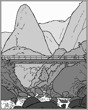
Aerial and Four Point Lineal Perspective on Location |
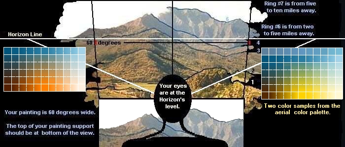
Aerial perspective on Concentric Rings Ring 1 is about 10 yards out, you should
4 Point Lineal Perspective
|
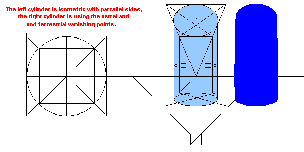
First draw the center line. A circle's center line always goes to the Center Vanishing Point, C.V.P.
The horizon line is always at your eye level.
Your view of this subject circle has tangents that mark the horizontal center line on the circle's perspective plane. The tangent points on the subject circle from the center line Vanishing Point is the horizontal center of the circle.
Doing that makes for four 90 degree sections, divide each section in half to find the 90 degrees centered on your horizon line.
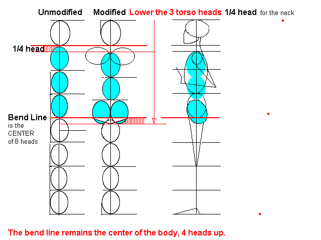
These are your centered Right and Left Vanishing Points 90 degrees apart. The remaining 90 degrees, 45 on each side should be positioned on the curved Horizon Line. They are lower than the Center Vanishing Point.
If two sides with one 90 degree angle is in view, the building's top visible sides are angled toward vanishing points ninety actual degrees apart on your horizon. No matter how tall the building is, or how far away it is, the sides are angled to these points. These points can be shared by other buildings if they're aligned to the first buildings side. As the buildings recede, the top angles will seem to increase and flatten out, but the angles on and touching the horizon line are decreasing. The total of the three angles will still equal 180 degrees. The three angles are the two vanishing points on the horizon line to the top of the building. The farther away the building is the closer it's top angle is to flat, but they still lead to the vanishing points 90 degrees apart on the horizon line and the combined angle total is still 180 degrees.
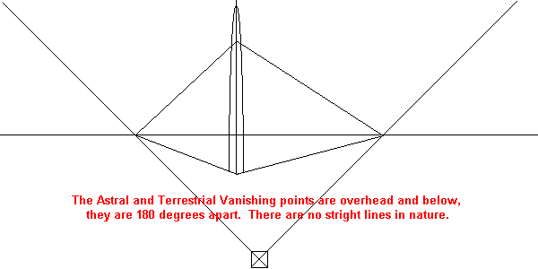
Have you ever heard there are no straight lines in nature? It's true, If you are standing in the center of a set of railroad tracts, the lines at your sides are parallel, they curve and join at some point out there in front of you, toward the horizon. The same with a telephone pole, it has straight lines at eye level and curves to a point up there, heading to the astral vanishing point. There is another vanishing point down below, the terrestrial vanishing point. The center of the curve is at your eye level.
The "astral" and "terrestrial" vanishing points are above and below the building, 180 degrees apart. Since we're working with two sides and no angles, they stay 180 degrees apart. Can you imagine how tall a building would be to meet up with the astral vanishing point? See what I mean about no straight lines in nature, The building starts off at eye level as two parallel lines, than they curve gradually upward toward the astral vanishing point directly above you.
The terrestrial vanishing point could be used like this. Your looking obliquely down at a table top with a lighter on it. With your angle of vision it's 45 degrees below the horizon line or, 45 degrees below your eye level. The sides of the lighter are heading down to the terrestrial vanishing point, they are not going plum-line or straight down, they have angles to meet at the terrestrial vanishing point.
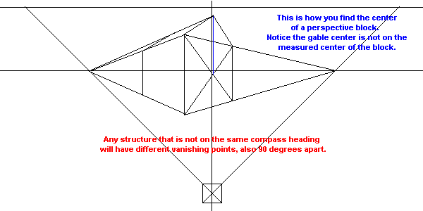
To find the optical center of any side of a building, in any rotation, join the four corners of a side with an "X". Straight up from the center of the "X" is the top of the gable.
The ground your standing on, if it's level, connects visually to the distant horizon line. Let's say you and your friend are both six feet tall. A hundred yards away, on level ground, his eyes and your eyes would still be on the same height, level to the horizon line. The line connecting your feet is the variable, it's angled up to the horizon line making him seem smaller.
To use this principle on an object, let's say a canoe is setting sideways in front of you. You want to draw it one hundred yards out there. You need to get the right length to distance ratio to make it appear the same size. This is easy, connect the two end points of the canoe to a vanishing point on the horizon line in the direction you want the canoe to be in, either on or off the center line of your picture. The canoe is correct anywhere between these two lines. The same principle applies to the mast if it were a sailboat.
PERSPECTIVE TOOL
A piece of equipment I made is used to plot two vanishing points of any building 90 degrees apart. It can be ten foot long or longer for larger paintings. A bar attaches to the back of the painting, level with and behind the picture's horizon line. It has two straight edge bars on pivots that clip onto the main bar and lock down on the perceived vanishing points of the top of the building. Sometimes times both vanishing points are off the page in a 60 degree wide picture. This tool will adjust for the earth's curvature.
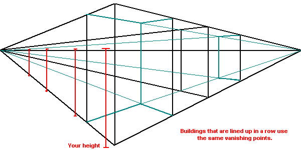
Match up the buildings most extreme top angles with the straight edge arms and hinge clip them onto the horizon bar, matching and lining up the angles of the straight edge bar to the buildings image. I look at the building and point to the extended vanishing points on the horizon line to the left and right in my pictures view and clip the arms on at those points. That position works now for any building in my picture with those compass aligned angles, as in a row of buildings down a street. Swinging the bar down will give you the correct angles of the windows, doors, bricks, etc.
REFLECTIONS
Your reflections are only there for
you to see, they angle straight toward you, not straight up and down in
relation to the sides of your picture.
New window link to Reflections.
33/ EDGES, CONTRAST 33-2, LIGHT AND CONTRAST EFFECTED-BY-EDGES
VALUE CONTRASTS, IT'S LIGHTEST NEXT TO THE DARK AND THE LIGHT.
Light interpretation as it relates to object edges. With the sun overhead and both the foreground and background in sunlight, the object behind is darker than the closer objects top edge.
Look at the sky as the background, notice any object is darkest next to the light while the sky is lightest next to the dark object.
It's coolest next to the warm, as when a sun lit edge meets the shadow.
The "Culminating Point" is a reflective term, the closest part of an object is the brightest if there is no direct incident light to interfere.
The sky's contrasts combine both the earthbound object's contrast rules and the water contrast rules, it can either be lighter or darker behind the closer cloud.
Have you ever noticed that barometric pressure keeps the cloud bottoms flat? If you made ten lines, a radiating grid from your center line's vanishing point on the horizon to the top corners and across your picture, and spaced the horizontal lines one hundred feet apart starting at the zenith to the horizon line, the variable would be the space between the horizontal lines. This grid would be the barometric bottom of the clouds.
On earth grids, concentric lines around you are the horizontal grid lines. On sea grids, use only the center vanishing point lines and any wave's horizontal lines.
Earth and Sea Grids will keep objects attached to the ground plane, see sea waves in perspective.
34/ INDEX, CONCENTRIC RINGS AROUND YOURSELF, GRIDS, AERIAL PERSPECTIVE
34-2, CONCENTRIC RINGS AROUND YOURSELF.
34-3, GRIDS
34-4, AERIAL PERSPECTIVE
CONCENTRIC RINGS AROUND YOU
EVERY OBJECT YOU SEE HAS IT'S EDGES ON THE CONCENTRIC RINGS AROUND YOU.
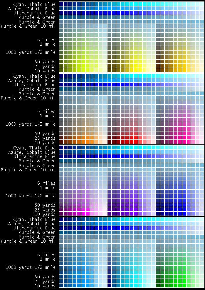
All concentric ring lines stay an even distance around you, you are the bull's eye of a target. Any distance line that is obvious in your scene will form on a concentric ring. Color values, distance, can be recognized from ring to ring. There's a difference between colors in the ring 10 yards in front of you and the ring 50 yards in front of you, try it, soon you will see the difference in every ten yards. Don't use one distance's palette colors in another's ring.
Colors within the first 10 yards are at they're highest chroma, the lights are brightest and the shadows are the deepest. Here are my basic ring distances away from me, 10 yards, 50 yards, 100 yards, 500 yards, 1/4 mile, 1/2 mile, 1 mile, 10 miles, 50 miles, 100 miles. Each ring's colors would not be repeated inside other rings. The foreground rings use the opposition of green and magenta for a medium neutral dark [CCYY+MMMM], the background uses green and purple [CCYY+CMMM], adding the extra cyan gives a more ultramarine blue to the mix.
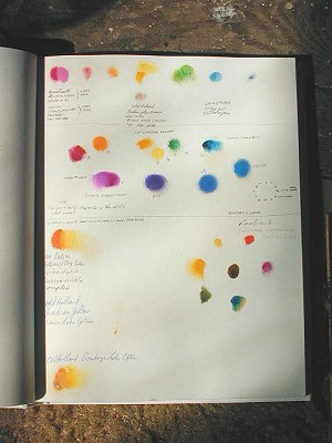
Click HERE for this web image map of concentric ring colors and values.
AERIAL PERSPECTIVE
The color and brightness of objects are effected by the addition of air and moisture in the air, air is a filter of Yellow and adds Reflected White Light, plus Cyan and Magenta.
What this means in paint is a slight difference in color opposition's, instead of the main opposition being Magenta and Green, it's Green and Purple, the split opposition or split analogous opposition. This filters out the Yellow. The mix of Green and Purple make the cool Blue of the distance.
When Yellow is used in the distance, it's mixed with white. Yellow light and blue light would make white light. Because we have no transparent Yellows or Ultramarine Blues, these pigment colors mix to Green instead of a neutral dark.
Shadows in the foreground are made by adding the opposite color to the local color, in the background the cooler split complementary color is added to the local color instead of the medium opposite color. Split complementary colors are two colors next to each other called "analogous". That is two colors opposite one color, across the wheel. Here's an example, Green is opposite Magenta, the split complementary colors of Green are on each side of Magenta, Scarlet and Purple. Add a split complementary color, Purple pigment to Green pigment for the cool distant color.
PAGE LIST, CHAPTER #35
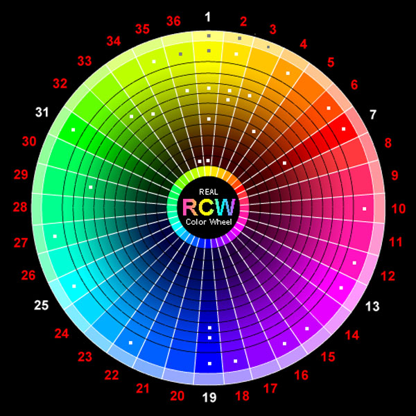
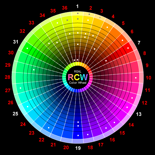
THE "ARTISTS REAL COLOR WHEEL" in pigment.
COLOR WHEELS
THREE, SIX AND TWELVE COLOR WHEELS
TWENTY-FOUR COLOR WHEEL, SIXTY COLOR WHEEL
TRANSPARENT-OPAQUE COLORS,
COLOR IN ELEMENTS, CRYSTAL
PIGMENTS, OIL.
PIGMENTS, 18 IMPORTANT COLORS.
PIGMENTS, THE BUYING ORDER.
PIGMENTS, FULL OIL COLOR WHEEL.
35-17,19 OIL MEDIUMS.
35-20, ACRYLICS.
35-21, 23 WATER COLOR PIGMENTS.
??RIDDLE?? What six, divided in two, is one? A. The basic six color wheel making the primary 3 color wheel in light or pigment.
There are two different basic three color systems in one six color wheel, one for pigments, one for light. They each use the same colors differently.
In each case, the three primary colors divide to the other systems secondary three colors. One six color wheel includes both systems, six basic colors make the two systems and one color wheel.
TRANSPARENT AND OPAQUE, PIGMENT TERMS
An opaque pigment is a dense solid, like a rock. A transparent pigment you can see through, like glass, water, dye or stain. A "Tyndall" beam of light will pass through a transparent solution unseen.
A translucent is a colloidal solid, particles of solid so small they are continually suspended but not dissolved. Milk is a colloidal liquid, solid fat dispersed in clear water, add more water and it becomes more translucent. It can always be more translucent but never transparent, the beam of light will always show.
Wax, oil and mastic are transparent turpentine vehicles to hold pigments, oil will yellow.
Barite is a translucent Mineral White extender.
Aluminum hydroxide is a mix of potash and alum precipitated together in solutions, it sponificates clear in oil.
Clay is hydrated aluminum silicate, and ranges from translucent to opaque. It is decomposed feldspar.
Pigments that contain clay are Ultramarine Blue, Ochers and Burnt Ochers, Umbers, Raw and Burnt Sienna, Green Umbers, Venetian Red, not Naples Yellow.
Opaque Chalk, calcium carbonate, converts to Plaster of Paris when heated. It's best in pastels.
Barite is heavy spar, mineral white, barium sulphate, it's translucent in oil and used to extend the Cadmium Red substratum dye pigment. Barite is a translucent Mineral White in oil paint.
Gypsum is a hydrated calcium sulphate called light spar, it ranges from transparent to a calcined White that sponificates clear in oils and is used in cements when calcined. It contains some sulfur that will effect some pigments. Gypsum is best in W/C's and pastels.
Ultramarine Blue is colloidal sulfur in a substratum form deposited on a base. A translucent pigment on a translucent base of Barium Sulfate or Aluminum Hydroxide.
Cadmium Yellow is a substratum color precipitated on a filler or base such as clay or barium. Cadmium Lemon is an opaque pigment precipitated on Titanium White as a base, it's an opaque color.
The reason Cadmium Yellow and Ultramarine Blue mix into a green opaque color is they are both opaque substratum colors instead of transparent colors. Food coloring is transparent. If you mix yellow and Ultramarine Blue, [a mix of Magenta and Cyan], together as dyes, they would make a neutral dark. An element like Iron decomposes from Yellow to Brown to Black.
Green Ocher, Yellow Ocher, Sienna, Red Ocher and Brown ocher are the colloidal iron particles precipitated on clay, they can never be transparent, only degrees of translucent and opaque.
If three primary transparent pigment colors were combined, they would form a neutral dark. You could use either a warm Quinacronone Magenta or a Cool Cobalt Violet [duel-toned from Violet to Magenta], either Magenta would work. Added to a Cyan Ferric-ferrocyanide or a Cyan Phthalocyanine, they would make Ultramarine Blue. The third primary to mix in would be Cobalt Yellow or Indian Yellow, they would make a neutral dark. Cobalt Yellow is translucent so it's far from perfect and we have not had Indian Yellow since 1890.
Staining coats an opaque solid with a transparent dye, both colors are seen in combination on the solid opaque, The more dispersed the solid the more translucent the liquid. Bleeding colors happen when the dye separates from the solid or the colloidal color moves within the drying medium.
Yellow will mix either analogously around the rim of the color wheel, making Yellow-Green or Green with Cyan, or Orange and Red with Magenta. Or it can move to the center of the color wheel and be a warm tan or brown as it does in the crystals.
COLOR IN ELEMENTS
Crystals will show that Brown, Yellow and Red are different hues of the same coloring element. They will also prove elements stay within there color boundaries. The painting properties of a pigment depend on the elements making that pigment. The copper element could never be yellow, each element has it's own limited range. Copper is an example, with it's limited range only going straight across the color wheel. The Cuprite crystal [Cu2O], is a transparent Red-YYMM, #3 on the Standard Color Index. The ore of copper [Cu] is an opaque Red-Brown, off of the full chroma rim, a centering brown color. It's opposite color on the other side of center is Cyan, Copper's dissolved color.
Turquoise is a transparent phosphate crystal of copper,
CuAl6[P04]4[OH]8.4-5H20, #9,[CCCC], Cyan, on the Standard Color Index.
Red-Scarlet,[3Y4M], plus it's complement, Cyan-Turquoise or Cyan Yellow/side, [4C4Y+3C3M], looks like this, as an opposition formula. [3Y4M]+[4C4Y+3C3M] = [7Y7M7C] or [7YMC] or [White], they all equal Neutral White light. Of course the same formula will make the neutral dark on the pigment color wheel. The transparent Mercury sulfide crystal, [HgS], is the Standard Color for Scarlet, #4, [YMMM]. Cinnabar also forms as an opaque mass, and makes the perfect opaque Red #3, Vermilion, it also makes colors ranging toward the center, through the color brown. Mercury won't cross over the center, as most elements won't.
The transparent Yellow-Green crystal, Sphalerite, [Zn,Fe]S, is #11. Sphalerite is the ore of zinc. It has an analogous color range from Green to Red, when it becomes allochromatic with the addition of the foreign element iron to the compound. Some elements like carbon, iron, fluorine, and zirconium can produce the entire color circle.
Transparent yellow moves to brown in the elements Iron, [Fe], and Titanium,[Ti], as in the allochromatic Citron crystal, Quartz,[SiO2], and the idiochromatic Sphene, [CaTiSiO5], which has Titanium already in the compound.
Transparent yellow can also turn red with the element iron, as in
the Sphalerite crystal, and Titanium dioxide turns red or brown in the
Anatase crystal, [TiO2].
CLICK FOR CRYSTAL AND COLORS.
PIGMENTS IN OIL AND ACRYLIC PAINT
Pigments are transparent, translucent or opaque, some need added bulk and are precipitated on transparent, translucent or opaque bases.
BARYTA WHITE- Opaque. This is a heavy spar with very little coloring power, usually it's a pigment additive. Barite is crystal of barium sulfate, called heavy spar. Barite is a non-metallic mineral crystal mined in England, filling the cavities in limestone. As barium it's an extender in lead based and cadmium paints.
HYDRATE OF ALUMINA, alumina, the oxide of aluminum present in clay, transparent to translucent
ACRYLIC POLYMER EMULSION, Transparent
WAX, Transparent
Here are some permanent chemical pigments used in oil and acrylic paints today.
TRANSPARENT YELLOWS
PY3 stable di-arylide = Yellow Lemon on barium sulfate, Gamboge,
Indian Yellow
PY83 stable di-arylide = Yellow Deep, Madder Lake, Alizarin Crimson,
Italian Brown Pink Lake.
PY83 stable di-arylide HR = Indian yellow
PY153 dioxine nickel complex = Indian Yellow Golden & Brown,
Gamboge, Indian Redgold, Sap Green, Indian Yellow Green
PO69 isiondolin = Yellow, Orange
PR260 isoindolin = Indian Yellow Golden, Vermilion to Red Scarlet
dual-toned
PY129 methin copper complex = Golden Green, Indian Yellow Green
with PY153
PR101 synthetic iron oxide = Translucent to Opaque Yellow to Brown
YELLOW PIGMENT COMPOUNDS THAT WORK WITH TRANSPARENT TRIADS FOR FULL COLOR NEUTRAL DARK OPPOSITION PAINTING
Transparent colors are precipitated on alumina, the oxide of aluminum present in clay. Another base for these colors could be wax, cyclohexanone or an acrylic polymer emulsion.
PY153 dioxine nickel complex + PR 260 isoindolin = Indian Yellow
Golden.
PY153 dioxine nickel complex + PY42 synthetic iron oxide = Indian
Yellow Brown.
PY153 dioxine nickel complex + PY3 stable di-arylide = Gamboge.
PY83 stable di-arylide + PR101 synthetic iron oxide = Italian Brown Pink
Lake.
I would love to try PY153 dioxine nickel complex + PY83 stable
di-arylide.
But the first acrylic color should be PY153 dioxine nickel complex
+ PY3 stable di-arylide on alumina, = Gamboge Synthetic.
TODAY'S PERMANENT TRANSPARENT PIGMENTS
PY100 azo nickel complex, tartrazine, Indian Yellow for water color.
PY153 dioxine nickel complex + PR 260 isoindolin = Indian Yellow Golden.
PY153 dioxine nickel complex + PY3 stable di-arylide = Gamboge
PR 170:F5rk naphthol carbamide = Scarlet Pink
PV19 quinacridone = Rose
PR122 quinacridone = Magenta
PV23:1r carbazole dioxazine = Purple
PV23 dioxine nickel complex = Permanent Violet Blueish transparent secondary blue, tints to Ult. Blue.
PB60 anthraquinone = Blue Deep to Turquoise
PB15 copper phthalocyanine = Cyan (Thalo Blue) to Green Y/S
PB7 Chlorinated copper phthalocyanine = Turquoise to Green
PY83 stable di-arylide + PG7 chlorinated copper phthalocyanine = Sap Green Y/S
PY83 stable di-arylide HR + PO7 chlorinated copper phthalocyanine + PO43 perinone orange = Sap Green O/S
PY129 methin copper complex = Green Gold
PY ? azomethine = Genuine Green Gold
TODAY'S PERMANENT TRANSLUCENT TO OPAQUE CHEMICAL PALETTE PIGMENTS,
needed for their opaqueness and brilliance.
PY35 cadmium Zink sulfide = Cadmium Yellow Lemon
PT37 cadmium sulfide = Cadmium Yellow Light, Medium
PO20 cadmium sulfo-selenide = Cadmium Orange
PR108 cadmium seleno sulfide = Cadmium Red Light, Medium
PR101 synthetic red iron oxide = Red Oxide
PY42 synthetic yellow iron oxide = Yellow Oxide
PBr7 natural iron oxide, raw and calcined = Siena and Umber
PB29 silica, aluminium, sulphur complex = Ultramarine Blue
PB28 oxides of cobalt and aluminum = Cobalt Blue
PG17 anhydrous chromium senquioxide = Chromium oxide Green
My Oil Pigment palette, the acrylic palette has no transparent yellows. (2010 W/N just made them!)
IN THIS MY OIL PALETTE ORDER, COMPLEMENTARY COLORS ARE NEAR OPPOSITE EACH OTHER
White is in the middle of my palette. The left top of the palette is Liquitex Dioxazine Purple, Mussini Ult. Blue Deep or Light, Rembrandt Cobalt Blue Deep, Grumbacher Thalo Blue, Mussini Opaque Green Light and Mussini Thalo Green or Grumbacher Thalo Green Y/S.
The left side goes from the top Liquitex Dioxazine Purple, Mussini Bt. Umber, Mussini Bt. Sienna, Blockx Venetian Red, Mussini Yellow Raw Ocher, Mussini Naples Yellow Light or Deep to Daniel Smith Quinacridone Magenta at the bottom.
The bottom row of colors is Daniel Smith Quinacridone Magenta, Rembrandt Rose, W/N Cadmium Red Light, Rembrandt Chinese Vermilion Extra, Mussini Cadmium Orange, Old Holland Indian Yellow-Brown Lake Extra, Old Holland Indian Yellow-Orange Lake extra, Old Holland Gamboge Lake Extra, Old Holland Cadmium Yellow Medium, Grumbacher Cadmium-Barium Yellow Pale, Bellini Lead Yellow Lemon is in the bottom right corner of the palette.
The right side is from Mussini Thalo Green on the top, then Mussini Permanent Green Light, Mussini Genuine Golden Green, Old Holland Yellow Green and Bellini Lead Yellow Lemon at the bottom.
Notes from the color industry, Alternatives to Cadmium Pigments.
It is apparent that we should not count on cadmium pigments being available forever. Golden Artist Colors has undertaken research in an effort to identify and market suitable alternative pigments. Important characteristics include hue or color position, chroma or color saturation, opacity, indoor light fastness, and tinting strength. Alternatives should also present distinct advantages over cadmium pigments in the areas of potential toxicity, environmental impact and exterior light fastness. This is quite a list of objectives, and presents a difficult task, particularly in the yellow range.
Today, there is no company to my knowledge concentrating on making transparent yellows or reds with dark mass tones. Old Holland oils has the only close Indian Yellow range. Instead, translucent and opaque yellow and red is the direction pigment manufactures are taking.
With the introduction of the Pyrrole family of pigments in 1988, there appear to be good offsets for cadmiums in terms of these identified criteria, for the orange to medium red range. Additional products utilizing this chemistry, currently under development by the industry, will extend this range into the darker reds. The pyrrole family of pigments is currently represented by three colors, Pyrrole Orange, Pyrrole Red Light, and Pyrrole Red. These are strong tinting, high chroma colors with excellent light fastness but without a deep mass tone.
Identifying suitable alternatives for the cadmium yellows has been
a somewhat more difficult task. The Bismuth Vanadate family offers many
of the attributes being sought, but concerns over the toxicity of the
constituent heavy metals (bismuth and vanadium), seem to indicate they may offer little
benefit over cadmium pigments. A member of the arylide family of pigments
seems to offer the best choice for the artist eschewing cadmium pigment.
This pigment, PY 74, is the colorant in Hansa Yellow Opaque. It
is of a hue between Cadmium Yellow Light and Cadmium Yellow Medium. Its
relatively high opacity and excellent interior light fastness are characteristics
not normally encountered in this class of pigment. Outside, its light fastness
is far superior to cadmium yellow and should also exceed the performance
of Hansa Yellow Medium (PY 73) and Hansa Yellow Light (PY 3), the other
members of this pigment family. There are currently no environmental or
toxicity issues associated with PY 74. The tinting strength of Hansa Yellow
Opaque is also significantly higher than what might be expected from an
arylide and is closer to that characteristic of a cadmium pigment. The
arylide yellows are entirely organic in composition, containing no metals.
While one pigment doesn't provide a range of choice equal to that available
in the current range of cadmium yellows, it is a starting point. Using
it as the primary component of a mixing color will extend its attributes
to other hue positions.
Although the properties of these new organic pigments are in many ways similar to cadmium colors, they are not identical in every respect. The biggest variation is how the colors mix to create new colors. Organics typically produce cleaner, less muddy mixtures. Other colors, such as the iron oxides, can be added if muddier colors are needed.
Once established, a pigment is rarely deemed entirely superfluous. Cadmium pigments will always have devotees, regardless of any disadvantages, for as long as it is manufactured. An example of this persistence is the continued demand for true Alizarin Crimson, a pigment that fades badly, long after the introduction of the highly stable quinacridone family, from which a nearly identical match may be made. Another example is the continued demand for lead white, despite its toxicity, concerns about environmental impact and suitability of Titanium and Zinc White blends.
These notes come from a chemist, not a practicing artist. No color will match the capabilities of lead white.
We as artists have lost lead yellows, including antimony yellow and the magnesium euxanthate yellow that was called Indian Yellow because we had no champion. That painting art is lost.
Long term availability of cadmium pigments may be determined by regulatory pressure or by reduced demand resulting from the increased use of new pigments.
(End of Paint Industry comments.)
As you can see, we as artists are going to have to contend with another set of pigment color properties. They don't relate to the color properties we had at the turn of the century. More great news, 2003, Liquitex has a new great medium for acrylics. It's called, Blending and Painting Medium. It extends drying time a little and makes blending edges a lot easier.
BROWN IS A TINT OF YELLOW IN PIGMENT. Yellow is the warmest color and the fastest to turn cool with the pigment Black turning it green, never brown. So by using black pigment, Yellow is disabled except for the muddier green spectrum colors. Don't use the pigment Black in landscapes, period. Any dark neutral is easy to mix with any of seven different sets of opposition colors.
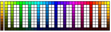
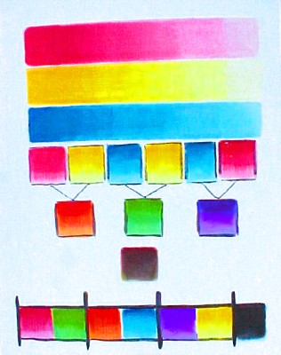
Here is a full color wheel of pre-made commercial pigments I like. The color wheel is like a clock face, Yellow on top and "Read Red Right", 12:00=Yellow, 4:00=Magenta, and 8:00=Cyan, are the primary pigment colors.
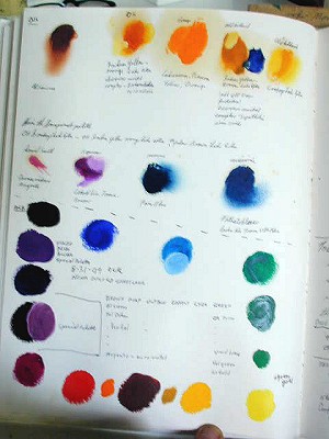
MY PALETTE IN OILS, 1 to 18 with mixing tips.
01. Lemon Yellow, 02. Indian Yellow Orange Lake Extra, 03. Cadmium Orange, 04. Cadmium Red Medium Light, 05. Naples Yellow Light, 06. Yellow Brown Lake Extra, 07. Yellow Ocher, 08. Venetian Red, 09. Burnt Sienna, 17. Burnt Umber, 11. Dioxine Purple, 12. Ultramarine Blue, 13. Cobalt Blue 12. Thalo Blue, 13. Magenta Quinacridone, 14. Cobalt Violet Phosphate, 15. Thalo Green, 18. Gamboge
These 18 colors are a very complete palette, not every one is used every time. Some of these colors can be replaced internally. For instance, Gamboge, Thalo Blue and Quinacridone Magenta will make a neutral Dark, so you can paint a complete painting with only three oil based paints.
Warm Magenta plus Thalo Green make the perfect Neutral Dark for the foreground. It's an afternoon opposition.
Ultramarine Blue plus Burnt Umber makes another perfect neutral, it has a big range of warm and colors on each side of neutral. This is a morning opposition, Yellow is actually a tint of Brown in the RBG system.
The coolest complementary on the palette mixes Thalo Blue with Cadmium Red Medium, a perfect dark to light, neutral gray. This mixture has a very short range of neutral however because of the opaque red. This is an evening opposition.
Purple and Orange will make an opaque Burnt Sienna.
Cadmium Orange, Cadmium Red Medium and Bt. Sienna will make a good opaque Venetian Red.
Cadmium Lemon Yellow and Bt. Sienna will make Yellow Ocher.
Ultramarine Blue and Bt. Sienna will make Bt. Umber.
Cobalt Violet Light Phosphate, [Cool Magenta], and Thalo Blue will make Violet, Purple, Ultramarine Blue, or Azure.
THIS WOULD BE THE BUYING ORDER IN OIL PAINTS, 1 to 21. YOU COULD STOP AT #3, #5, #7, OR #15, AND PAINT ANYTHING IN FRONT OF YOU.
|
The three colors uses to make this color circle
were,
Here is the same color chart made by my friend Scott Methvin |
01. Old Holland, Gamboge Lake Extra or Indian Yellow Extra, Transparent Yellow.
02. Grumbacher Thalo Blue.
03. Danial Smith Quinacridone Magenta.
04. Blocks French Ultramarine Blue Light, the dark has more Magenta in it so it's a different color.
05. Grumbacher Bt. Sienna
06. Grumbacher Thalo Green.
07. Rembrandt Chinese Vermilion Extra, a translucent Red Medium. Extra means synthetic.
08. Grumbacher Cadmium Barium Yellow Pale.
09. Grumbacher Burnt Umber,
10. Grumbacher Carbozle Dioxazine Purple
11. Mussini Cadmium Orange
12. Bocour Cobalt Violet Phosphate, a duel-color from an almost warm Magenta to a cool pink magenta that matches the lithographic printer's magenta.
13. Mussini Yellow Raw Ocher.
14. Blockx Venetian Red.
15. Mussini Naples Yellow Light. The Antimony Lead version is not in wide production.
16, Rembrandt Asphaltum Extra. A weak, oily, warm Yellow-Brown transparent glazing color.
17. Mussini Transparent Yellow Oxide, a translucent dark tan to yellow duel-tone color.
18. Mussini Raw umber, a warm translucent Brown to Yellow-Brown that cools with the addition of White.
19. Mussini Green-Gold Transparent duel-tone warming up to a transparent light Yellow-Green from a mass-tone green-oxide color.
20. Grumbacher Green Earth, a translucent pigment that mixes with Rembrandt's Chinese Vermilion Extra translucent. They mix warm or cool in the flesh range, use Naples Yellow Light for the Yellow. This is an "old masters technique"
21. Rembrandt Chromium Green Oxide opaque.
CLICK HERE FOR LIGHT TO CRYSTAL CONVERSION INTER-ACTIVE CHART, go to the Color Section in a new window.
New Window comparing color wheels.
Here is the 36 color RCW palette with an extra
warm yellow to match pigments, plus a tinted mode.
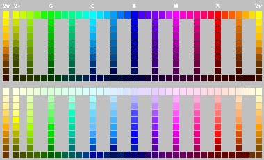
The colors are listed in my painting palette order which is different. White is in the middle of the palette. Here is the list of pigments in their spectrum order.
Here is the dual-toned Under-tone color of Old Holland Indian
Yellow-Orange Lake Extra. #"FFF000", R=255, G=240, B=000
1d.
Old Holland Indian Yellow-Brown Lake Extra. It makes a good dark triad
neutral, but not a strong Yellow, more like a Cadmium Yellow Middle Under-tone.
(Old Holland Indian Yellow Brown Lake, has a Warm Tan Ocher top-tone with
a Middle Cadmium Yellow undertone. It makes a poor Orange but will turn
Ultramarine Blue to a nice Neutral Dark if that is all you had on a three
color palette.) We artists REALLY need this color in acrylics and water
colors, not just in oils by only one manufacture. NEW, Liqutex Quinacridone
Acra Gold in acrylics. A Yellow/side Burnt Sienna if you will. #"986011",
R=152 G=096 B=017. Below is the Under-tone color of Old Holland Indian
Yellow Brown Lake Extra and Liqutex Acra Gold Quinacridone PO:49 + PO:45.
A transparent Under-tone of Rembrandt or Mussini Asphaltum and the new Benzimidazolone PBr:25 is clickable below
03a. Mussini Naples Yellow Deep, (True Naples is either Green-side, Yellow-side or Red-side, higher firing temperatures make warmer, lighter colors. #"D9A878", R=217 G=169 B=120, CMYK= 60Y 40M
05a. Grumbacher Cadmium Yellow Medium. #"FFE709" R=255 G=231 B=009
A top-tone of Mussini Translucent Yellow Oxide is clickable below
To See an Under-tone (the color with clear medium) of Mussini Burnt Sienna, click below.
Below is a high Top-tone tint of Mussini Burnt Sienna.
An Under-tone of this tube color is here below.
Here below is a light Top-tone of Rembrandt Rose, the perfect Pink, notice it is getting cooler. #"FF4186", RGB, R=255, G=065, B=134
Cool Top-tone below Cooler Top-tone with more White below, Warm transparent Under-tone below
A tint Top-tone color of this pigment is this radio button below.
A Top-tone tint of this color is:
A Top-tone tint of this color is:
A Top-tone tint of this color is:
A Top-tone tint of this color is:
A middle Top-tone tint of this color:
A very high Top-tone tint of this color is, RGB, Cyan:
A lighter tint of this color is:
A tint of this color is: RGB, 000, 225, 233,
A Top-tone tint of this color is: RGB, R=000,G=255, B=176
33a.
Mussini Permanent Green Light, warm opaque. #"00590A", R=000, G=089, B=010,
CYMK= 80Y 80C
A tinted Top-tone by adding white of this color is: RGB, R=000,G=255, B=147
A tint with added white of this color is: RGB, R=152, G=197, B=000
A Top-tone tint by adding white to this dual-toned color is: RGB, R=246, G=255, B=000
These colors make painting very easy indeed.
Return to WhiteOr,
a cool neutral tint. #"CCCCCC" R=180, G=180, B=180, CMYK= 20Y 40C 20M,
RCW= Any triad or complementary set of colors, plus white.
|
Top-tone is adding White to the color.
All dots are links to pigment colors. The center links to the photo color chip chart.
|
|
|
Top-tone is adding White to the color.
A Picture of my complete palette layout to paint anything in front of me, quickly. NEW WINDOW THIS CLICKABLE RGB MAP shows the true opposition pigment colors for mixing neutral darks. EACH COLOR WILL OPEN IN A NEW WINDOW It will be the new "basic" color wheel because the color oppositions are accurate. The revolution of color wheel, replace your old color wheel now. The Red-Blue-Yellow is wrong and Yellow-Cyan-Magenta color wheel without correct darks is inaccurate for pigment artists. 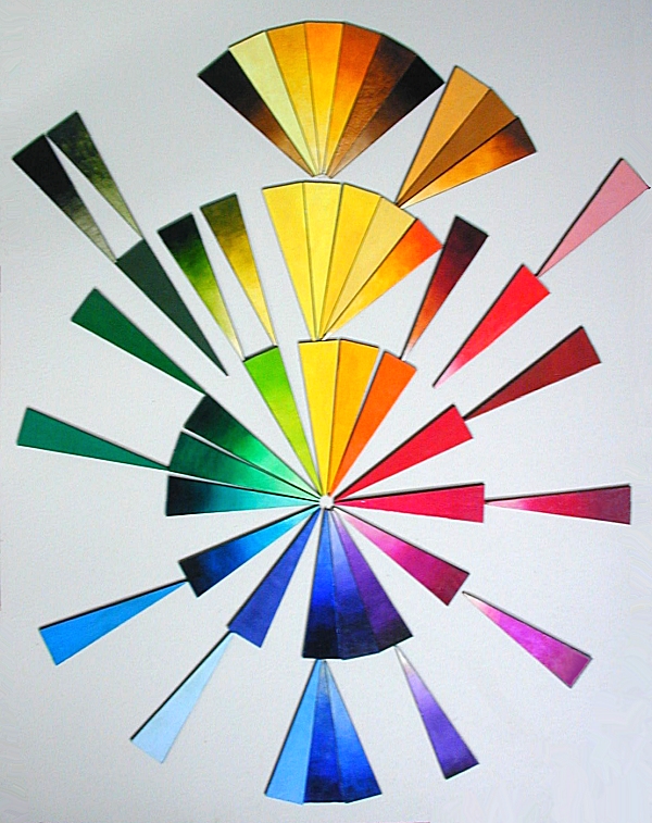
End of Pigments, Return to START.
MEDIA MASTIC MEDIUM
|